MOCCA STUDIO | Logo Critique

Status
Not open for further replies.

G.A

Member
MOCCA STUDIO
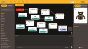
is a graphical robot programming tool based on the use of video and language-based intelligence blocks.
1616157724275.png1616157747418.png1616157784370.png

[removed - Levi, moderator]


Artboard 1.pngArtboard 2.pngArtboard 3.png

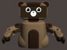
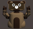
The goal was to create a dynamic avatar that would best represent a unique, engaging, and fun experience that could become the symbol of a community.

Let me know your opinion about it!
 
Last edited by a moderator:
The name makes me think of coffee rather than some piece of software and if it wasn't for your text I'd have absolutely no idea what it's for.

I've also edited your post as it sounded more like a sales pitch/advert rather than a request for a critique.
 
  • Like
Reactions: G.A
Why all the emoji faces? What are they for?

Not sure what the brown bear is for. Is that the thing you program? If so, why is the logo black/white/green when the bear is brown?

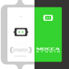
Is the logo 'Mocca Studio' or the {..} thing?
 
  • Like
Reactions: G.A
I don't fully understand the project to comment.
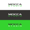
But the kerning is terrible in Studio.

I haven't really looked too closely at the rest. If the goal was to create a robot avatar called Mocca - then you did it.
Bears are brown - so that's fair. No issues with that.

The logo or wordmark has the ears sticking out the side - the avatar has them on top...

I don't really have anything else to say about it. I don't know what it's for or what's going on - not enough info.
 
  • Like
Reactions: G.A
Why all the emoji faces? What are they for?

Not sure what the brown bear is for. Is that the thing you program? If so, why is the logo black/white/green when the bear is brown?

Is the logo 'Mocca Studio' or the {..} thing?
The emoji faces stands for part of a brand identity idea where its use may vary from circumstances. An example: the avatar with the X-shaped eyes could appear when the programming has errors and does not work. The original colors of the project are brown like the bear, but my proposal has different colors from the original ones used as they are too dull in my opinion (the intent would be to give a fun perception of the project).

The logo is both the wordmark and the abstract mark: it is obvious that the avatar could be used in a more dynamic way
 
I don't fully understand the project to comment.
But the kerning is terrible in Studio.

I haven't really looked too closely at the rest. If the goal was to create a robot avatar called Mocca - then you did it.
Bears are brown - so that's fair. No issues with that.

The logo or wordmark has the ears sticking out the side - the avatar has them on top...

I don't really have anything else to say about it. I don't know what it's for or what's going on - not enough info.
As for the avatar ears, my intent was not to stick to the bear ears. The way I wrote it, they are a primarily a reference to the brackets used in programming.

The informations about this project, which I got from their site, are just these.

Which advise can you give to me to improve my kerning in general?
 
Who is the target customer of the software? As a developer I’d prefer a label to an avatar.
 
That changes things. Will they know what each of the avatars mean? Or is there an associated label?
 
That changes things. Will they know what each of the avatars mean? Or is there an associated label?
They will understand and know the meaning of each avatar because we would be talking about implementing an interactive system, where in the training area we would explain the general operation of the application
 
That doesn’t answer the question. If I see an avatar with slanty eyes how will I know what this means? Would I have to refer back to my training?

Im struggling a bit here to understand how this works. I develop software and write training documentation. Icons of any type can cause confusion unless they are very well known. For example, even a question mark icon can mean different things depending on how it is used.
This is a good point but I can't answer it fully. Going to implement this brand identity system would mean being an integral part of the project and planning the system with the entire technical department. Being an external proposal, I don't have enough information to fully understand how the program works, and therefore where and how to integrate everything.

Even if I were to devise its operation, without a contact this can only be an abstract concept and hardly applicable if it does not correspond to a targeted planning.
 
1 second after initiating a project using this software your branding becomes irrelevant. Nobody will care. The logo won’t be seen nor will the avatars.

Think about the device you are using right now. Do you see the OS logo? Do you notice the colours, fonts etc? Or do you just use the applications?

Also worth considering is visual impairment. Colour blindness and acuity affect many people. They will struggle with those avatars unless they are a lot bigger.
 
your branding becomes irrelevant
I beg to differ. The branding is always relevant, otherwise companies wouldn’t spend millions on it. Perhaps not from a practical, functionality standpoint, but from an emotional one, most definitely.
 
  • Like
Reactions: G.A
I beg to differ. The branding is always relevant, otherwise companies wouldn’t spend millions on it. Perhaps not from a practical, functionality standpoint, but from an emotional one, most definitely.
Yes, but this a programming application. The branding is irrelevant. You create a series of actions the robot will follow. That’s the bit the students will focus on not the logo/avatars.

Most likely there will be some marketing to promote the application. The students will be told to use it. Ergo, the branding in this case has little relevance.

The UI/UX is far more important.

If you use an Adobe product do you really care about the Adobe logo?
The UI / UX is more important, and we agree on that, so what? Why should this reason exclude another component?

Now tell me something: what is a brand to you?
 
Now tell me something: what is a brand to you?
In a couple of sentences?! A Sisyphean task indeed.

Brand is the inherent culture of something. Branding is the visual representation of that culture. The flag it stands behind with all the emotional associations that go with it. That doesn’t come close, but best I can do in a few words. There are plenty of more qualified people than I can explain it better. Read Wally Olins. He knows what he is talking about
 
  • Like
Reactions: G.A
If you use an Adobe product do you really care about the Adobe logo?
Not directly, but the brand as a whole is important in helping to convey their place, their direction, their goals. Everything about Adobe’s software and user interface is ‘Adobe’. It is not neutrally a functional interface it is part of who they are and designed accordingly.

The logo, in and of itself, as a stand alone graphic has little immediate, direct impact, but as part of a wider whole, it is definitely of some import. A logo is only ever a mnemonic for an organisation’s culture, ethos and aspirations. If not, why is Adobe’s brand identity different to Affinity's, or Quark’s? They all do different jobs in representing those companies, services and products and in helping us make our choices. Adobe is an odd one, in that, it is slightly different because it pretty-much has the market sewn-up and has a captive audience amongst pro designers.

I understand what you are saying, given the UI/UX nature of this particular case, the emphasis is far more leaning that way, but I always think it is a flawed approach to ever split them up and treat them separate, individual components. They are symbiotic and designed correctly, work with each other to support each other. Even if you are designing ‘just’ a UI, it is always a UI for a company, or organisation of some description and should sit within their ‘culture’ and be utilised for a particular purpose.
 
Status
Not open for further replies.
Back
Top