Logo for me : )

Moominbaby

Member
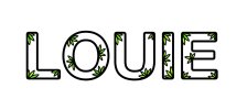
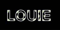
Hi Just wondering if anyone could give give me a little feed back on my logo.

Basically it wanted to give a feel of my illustrative side. I also didn't want to do down the route of including design or graphic designer in it. Also I am quiet arty so I wanted this feel and not too serious not in a cartoon way but in a 'hey I can draw and have a creative side but i can create clean simple and contemporary work. I have used it a couple of times so far and you can see it in context at my blog and website. I also just used my first name because I have a fairly unique name and thought I should use it simply and it might stop people calling me louise! lol!

Well know I've stopped banging on about it, have a look, go on you know you want to!

http://louie_crooks.prosite.com
Louie Bowers

Thanks in advance (and I promise not to start an argument on here like some recent posts lol):icon_smile:
 

Attachments

  • Louie.jpg
    Louie.jpg
    20.2 KB · Views: 53
Yes it was originally handrawn but I didn't really want to put myself into the 'illustrator' box because I am a graphic designer and have found this can put people off if they don't think my skills are transfereable.your thoughts on this true hmm not true??? Hmm I dont know blah! doing this for your self is so hard!
 
Prehaps if the petals/leaves were different shapes? I would add some description if it's not going out on a letter or leaflet - you could be a children's clothing line!
 
I would be tempted to make the individual letters interact with each other somehow, maybe the leafy element could cross over two letters, bridge the gap somewhere, something like that. I would also be tempted to give it a more delicate look - i.e reduce the thickness of the stroke on the letters.

I think you may need to vary to appearance/size/shape of the leaves a little as my first thought when i see them is "weed", does anyone else get that?!
 
Haha weed! didn't see that!
Yes I really like the idea of making it more deitcate and intereacting with each other. I think that might give less of a ridgid look as paul said.
I am recluctant to add more wording detail etc as it will never really be used on its own. I would use it for my CV, Buiseness cards, Blog and things like that and they will already have explanations etc on there so it would be in context. But thanks though.
I will try some more delicate stroke too thanks
 
You could just have 'Graphic Design & Illustation' underneath. I understand you want to show your illustrative side, but like you say, if you go too far, people will think that's all you do.

Branding yourself is so much harder than branding somebody or something else. Usually when you're branding someone else they tell you about them. They tell you what they do and sometimes what they want it to look like. Obviously being a designer you'll have so many ideas you don't know where to start, I know that was true for me.

If you're heart is set on something illustrative to show this side of you, why not combine the 2? Have the letters in a regular font with something illustrative on the last one or something. I think it could be dangerous drawing or illustrating the whole thing.
 
Sorry, just had a quick thought.

If you want to show yourself as a graphic designer and an illustrator, why not do 2 variations of the logo, with 2 variations of a business card, 2 different letterheads etc. It won't cost any more in printing. That way you can sell yourself as both.

I think the name Louie in a lovely typeface for graphic design, with an illustrative version (could be totally different) could work really nicely.
 
So it would say "Louie Louie" in two different styles on one business card? Not sure on that one, plus now I have that song stuck in my head...
 
So it would say "Louie Louie" in two different styles on one business card? Not sure on that one, plus now I have that song stuck in my head...

No, she would have 1 set of business cards for her graphic design based clients, and 1 set for her more open illustrative clients.
 
Not blown away by it, to be frank: looks a bit like you've found a decorative font you like and written your name in it. Also feel that the proposed solution of two seperate designs for different types of work is a clumsy way of addressing the underlying problem.
 
Oh yes thanks I like this, that why I post on here not too many complete nutter, well not many! : )
Hmm I will have a think and a sktech and post again
Hope you guys havent got bored yet!
 
Rethink

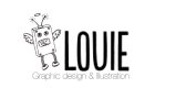
Hi soooo I had a think about all that was said and .... how about this? completely different but I like it too.
Its only a concept so don't worry about the pixilated font etc... I will draw it all up in illustrator
Just wondering about the general concept
thanks!:icon_smile:
 

Attachments

  • Louie robot.jpg
    Louie robot.jpg
    32.1 KB · Views: 27
Hi soooo I had a think about all that was said and .... how about this? completely different but I like it too.
Its only a concept so don't worry about the pixilated font etc... I will draw it all up in illustrator
Just wondering about the general concept
thanks!:icon_smile:

really like it. I much prefer this to the original idea you had. It shows off your illustrative side, as well as your graphic design side with nicely set typography. (Sorry to be picky but Design needs a capital letter if Graphic has got one)

Only thing I'd worry about is resizing that illustration. Have you printed it out on a business card to see if it's still visible?
 
Oh great thanks yes don't worry about being picky its fine but like I said just a mock up I will post up once its done all neat and tidy and then you can tell me I spelt it wrong! haha blah! stupid dyslexia the baine of my life : ) Thanks for the input I always think you know deep down when some things not working :) you just need to be called up on it
 
Oh great thanks yes don't worry about being picky its fine but like I said just a mock up I will post up once its done all neat and tidy and then you can tell me I spelt it wrong! haha blah! stupid dyslexia the baine of my life : ) Thanks for the input I always think you know deep down when some things not working :) you just need to be called up on it

No problemo.

One thing after looking at it again - the 'Graphic Design & Illustration' line looks a tad uncomfortable to me. It's a lovely font choice but think it's slightly too big and slightly too thin to fit well with the Louie font above. Try making it slightly thicker and a little smaller and increase the space between the letters to realign it to the bits above. But again, I'm just being picky. I'll shush now. :icon_tongue_smilie:

I like it though. :icon_thumbup:
 
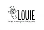
Illustratored up!!!

so any suggestions for this one would be very helpful if your all not to bored of this:icon_smile:
 

Attachments

  • robotlouie.jpg
    robotlouie.jpg
    36.1 KB · Views: 19
Back
Top