You are using an out of date browser. It may not display this or other websites correctly.
You should upgrade or use an alternative browser.
You should upgrade or use an alternative browser.
Logo Critique
- Thread starter Stationery Direct
- Start date
Not really doing it for me - and you know me and gradients in logos - that shadow... I'm not liking you at print stage!
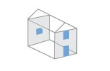
3D iso looks good - does it need the windows?
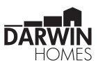
Maybe a play on the Darwin theme
Have a little box - then next box larger - eventually growing to shape of house.
Like monkey to man image
But with houses?
3D iso looks good - does it need the windows?
Maybe a play on the Darwin theme
Have a little box - then next box larger - eventually growing to shape of house.
Like monkey to man image
But with houses?
Thanks for the feedback, yeah name is set now.I'm afraid there's not much you can do with a D in this case, does it have to be Darwin?
Levi
Ultimate Member
I'm going to be a little different, I don't like the ISO one, probably because I'm just seeing the technicalities of it which are wrong (you wouldn't see the 'hidden lines' or they'd be a different line weight). The lettering is a little obscure too and the 'windows' aren't at the same angle.
I kind of like the idea of the first one though, it's not perfect and I'm definitely not keen on the font choice but I kind of like the simple 'roof' shape (lose the vertical 'wall') and think you could maybe play with that a bit more. You could also do a 'condensed' version using just DH.
Just a random thought and not sure how this would actually play out but what about making the DH into a 'terrace' of houses.
Levi
Ultimate Member
@Stationery Direct
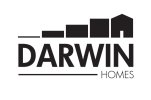
That (door over I) doesn't really work for me, I think using 4 blocks might not be quite enough and personally I'd lose the door
And check the spacing between the blocks, the one between 3 and 4 looks slightly smaller.
I do like the direction though.
That (door over I) doesn't really work for me, I think using 4 blocks might not be quite enough and personally I'd lose the door
And check the spacing between the blocks, the one between 3 and 4 looks slightly smaller.
I do like the direction though.
Thanks Levi
Yeah just doing rough mock-ups, once I have something suitable that seems ok I may get someone from here to refine it and add colour etc.
Yeah just doing rough mock-ups, once I have something suitable that seems ok I may get someone from here to refine it and add colour etc.
fisicx
Active Member
I always consider how it will look on a mobile phone. Will it still work when all squished up and only 40px high?
Or maybe you will have the full size on the landing page but when moving round the site have an icon in the corner.
The stepping stones might work if you are a builder (showing the house being constructed), otherwise they don't really mean much.
Or maybe you will have the full size on the landing page but when moving round the site have an icon in the corner.
The stepping stones might work if you are a builder (showing the house being constructed), otherwise they don't really mean much.
Those things are almost after-thoughts in the design process.
For the 40px high version you could just have the D - or a house Icon.
They're not stepping stones either - it's the evolution of a house build- concept.
For the 40px high version you could just have the D - or a house Icon.
They're not stepping stones either - it's the evolution of a house build- concept.
scotty
Ultimate Member
I think you have to be really clever to pull this kind of thing off but I totally think this one's very much getting there.
I like the one with four stages and although the negative space for the door and the I is nice, it doesn't balance as well as the one that aligns to the right but it's personal choice.
I can instantly get the Darwin, building and the evolution of man thing.
Clever!
I like the one with four stages and although the negative space for the door and the I is nice, it doesn't balance as well as the one that aligns to the right but it's personal choice.
I can instantly get the Darwin, building and the evolution of man thing.
Clever!
Just wondering how this will look on printed items, for example top right of a letterhead would look good as it is right side heavy, but centered on anything such as an outdoor vinyl banner?
Try the homes in bold and left align.
It might balance with the heft on the right.
It might balance with the heft on the right.
