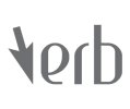
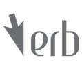
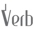
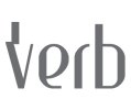
Im working on a Software engineering brand trying to get a logo sorted, Any pointers?

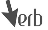
It nice to get anothers opinion, thank you. The wife did like the micro chip one and the last mouse pointer one. I have played around with the pointer being the 'V' but cant seem to get it to sit right with the word. As the V is difficult to tie in anyway. Heres me trying to bring together the logo together.Verb new2.jpg
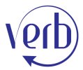
 
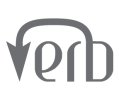
Yeah ive played around with that idea it just doesnt sit right for me, whatever angle i put the pointer on. What about the typeface, what is your opinion, i think it looks rather nice. Your opinion on the blue circular logo above would be appreciated, i know the who circle and logo thing has been done a million times but the progressive line to the type weight seems to work in my mind.Verb new4.jpg
This one doesnt work because the pointer is 180 degrees, but which ever way i go it doesnt fit.
 
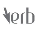
The font is OK, not a big fan tbh but that's just personal preference. Tru increasing the size of teh arrow but shortening the stick part and rotating a bit?
 
Not really doing it for me and I guess maybe the arrow point needs to be bigger? Anyway it's not the best idea in the world it was just the first thing that struck me when I saw that version.

Maybe play with the microbug again and look at other concepts - the brief says abstract does it now? Think about a letter V its symmetry, the negative space that letters make etc etc
 
Last edited:
And maybe concentrate on a V logo? The shape of it lends itself to so many interpretations...google "abstract V logo" for inspiration...........but don't copy!!!
 
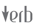
Thank you for the link, The word verb could use punctuation, or something... Speech, action... Could try tie that in, and be literal with the name.Verb new10.jpg
 
Last edited:
I like the pointer shape. The font you've used for the 'ERB' is putting me right off it though. If you're using some sort of shape for the V, I'd stick to something really plain and simple for the other 3 letters. Something like Gotham of Agenda.
 
Try a few versions and some other ideas, I think if you limit yourself to one approach then you're not letting the creativity / imagination flow
 
Only problem is this is my first project, just managed to skip btec and go straight into foundation degree (motorbike crash's), and because im getting more and more projects piled on top of this one i want to get this one tied down to a logo to get the elements sorted then a corporate identity manual and a sketchbook. Get that project out of the way. Ill play around with the negative pointer, but as for other ideas i think i need to limit myself other wise ill go on and on. Not really knowing where to stop, im sure ill pick up that skill soon.
 
My best bit of advice is LEAVE THE COMPUTER ALONE! Seriously. Sketch on paper, just doodle, start out with your idea then add to it, cross bits off, start again etc. etc. You will honestly have more brainwaves that way than trying out negative space in Illustrator (you are using Illustrator right?)
 
Hi, Yeah i started that way thats what iis giving me all these ideas. Ive got hundreds of doodles. Apparently this project is to see if we have the creativity, which the tutor says i have, but that will beno good if i cant come up with a final design. I would like to get this sorted as theres only a few weeks left before hand in.
Yeah im in illustator. Im trying to keep the logo simple as ive got into the habit of making very complex logos, and from research simples logos are the way forward.
 
I get what you mean about wanting to getting it nailed down but if you go on with the mentality "this will have to do" you know yourself it really isn't going to be your best effort. If you aren't getting enough info from the brief you have been given, go back and ask for it to be expanded. You will get more credit from yout tutors for doing that than handing in a half-arsed effort. In the big, bad real world if I am designing for a client and there isn't enough info from their design questionnaire or I want to clarify something I go back to them and ask. Better that than send them proofs that just don't cut it.

In the meantime try and think about this logo in other ways, the word is "verb" which is obviously very much a lingustic concept; you're dealing with programming which is a language - is there something to be explored there?
 
Back
Top