You are using an out of date browser. It may not display this or other websites correctly.
You should upgrade or use an alternative browser.
You should upgrade or use an alternative browser.
Im working on a Software engineering brand trying to get a logo sorted, Any pointers?
- Thread starter marciecbr
- Start date


spottypenguin
Active Member
How about using something "computery" for speechmarks (and putting them in the right place)? BTW not really loving that last one, but that's just me

spottypenguin
Active Member
I meant maybe try making the speech marks out of something computery and would you lose that font!!!
Anyway YOU come up with some ideas, not doing this for you dude ... but happy to help
Anyway YOU come up with some ideas, not doing this for you dude
... but happy to help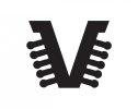


...When I first looked at you last version I straight away thought "that mouse pointer is screaming out to be made into the V" - and I am not saying that would make a great logo, just my initial impression.
I think you could do something with the arrow/cursor by experimenting with it as the bottom, reversed-out half of a capital letter R: I think this might lead to a more elegant solution as it would retain its angle and, therefore, its familiarity.


Tony Hardy
Well-Known Member
I think you're chucking too much stuff out and hoping that something sticks. I understand your eagerness to finish the logo up, but I'd honestly just pause for a little while and think about what you're trying to achieve here.
spottypenguin
Active Member
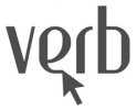
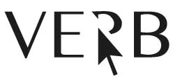
View attachment 1798 Reversed out like so? The font im using isnt finished so no capitals as of yet. I should really change typeface haha
Nooooo, the bottom section of a capital R (the space between the two legs).
Sorry mate but have to agree with Tony, you're chucking a load of things out there in the hope that one may just work. That's not how good logo design works.
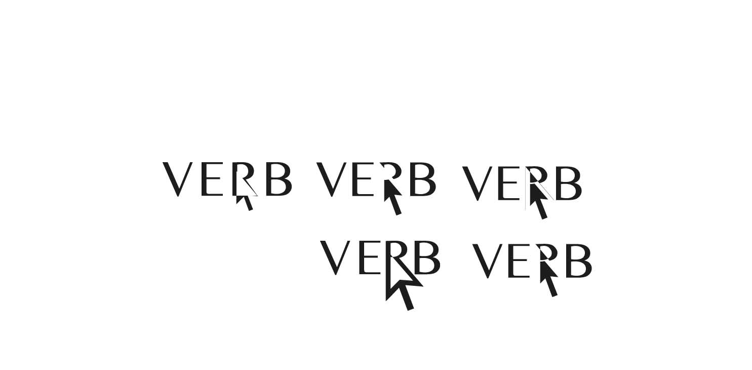
After a bit of thought i may be getting somewhere. Usually i come across something i like fairly quickly, but with this one i just cant seem to find any gems. I think im going to find a logo questionnaire and make a brief from that otherwise im going to keep chucking out rubbish designs. But thoughts on these would be helpful...
Tony Hardy
Well-Known Member
The font doesn't scream "software company" to me. It says "fashion magazine". That last one you've posted there is the least offensive of all of them, still don't think you're getting what Spotty Penguin was getting at the R and the arrow.
EDIT: Having said that, they are much better than all of the others so far.
EDIT: Having said that, they are much better than all of the others so far.
spottypenguin
Active Member
Go over to dafont and have a look, they have thousands... off the top of my head look at Sansation or Erasmus