Logo Critique

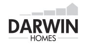
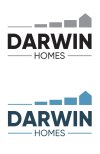
I'd lower the fourth one just a fraction, I know what stage of the build that's supposed to represent (bit before the roof goes on) but I think it would just look a little better being slightly lower, actually 2, 3 and 4 might need lowering a little. Try putting a 'ruler' on the same point on each block and then play with it by eye.

I'd agree with moving the homes to the left for balance an that there is some 'balance' issues with the darwin text too.
 
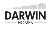
It didn't look right with homes left justified, I have brought the overall height of the houses down a touch, maybe making the text stronger will help to centralise it a bit, any thoughts?

Untitled-3.jpg
 
Last edited:
Those things are almost after-thoughts in the design process.
For the 40px high version you could just have the D - or a house Icon.

They're not stepping stones either - it's the evolution of a house build- concept.
Should they be an afterthought? If you are just going to use a D of house icon doesn’t this defeat the whole point of a logo?

I thought they look like stepping stones. I’d not associate them with evolution of anythingx

But maybe that’s just me.
 
I just had a quick play, nothing major done and while I liked the idea in my head I'm not sure the shift to the 5 blocks to the right is working now I've done it. The one thing I do think works better is the higher pitch on the roof, it's more 'monopoly' house shaped if you get me. Oh and I removed the door, purely for simplicity of the shape and because it's not there in the others (it would really be visible in 3 and 4)

darwin.jpg
 
Should they be an afterthought? If you are just going to use a D of house icon doesn’t this defeat the whole point of a logo?

I thought they look like stepping stones. I’d not associate them with evolution of anythingx

But maybe that’s just me.
God yes - if you're trying to fit your entire logo into a 40px wide space and designing for that then your logo will be naff.
Look at GDF here -pretty long name - just using a forum quote bubble - not even a logo present on the page when typing.

IMDB for example - there logo doesn't work as a favicon - but they still jam it in there even if not legible.
I can see the logo here on my phone. Looks fine to me - because it’s not too high and quite readable. The Darwin homes logo doesn’t work in the same way because it’s too tall, that was my point. If you are just going to use the house bit in a website header all meaning is lost.
 
I can see the logo here on my phone. Looks fine to me - because it’s not too high and quite readable. The Darwin homes logo doesn’t work in the same way because it’s too tall, that was my point. If you are just going to use the house bit in a website header all meaning is lost.
Yes, but it doesn't for me.

Amazon then - they just use the a with the swoosh arrow underneath.

The point here is concept though - not finalised.

So with a tall logo - you can make a wide logo. You can make an icon. You can make anything you like.
You're the designer - you don't have to limit the scope of the whole design to fit in 40px.
The designer designs solutions, and doesn't create problems.
 
I can see the logo here on my phone. Looks fine to me - because it’s not too high and quite readable. The Darwin homes logo doesn’t work in the same way because it’s too tall, that was my point. If you are just going to use the house bit in a website header all meaning is lost.
Thought this might be interesting for you to read.


Typically when designing a logo that is a Wordmark with an icon - the designer can make the opportunity for the Icon to be a separate design element to the Wordmark.

Essentially the logo can be split in two for different uses.

This presents an opportunity to use the building blocks as bullet points in a brochure.

<smallest block> great team
<smaller block> free estimates
<medium block> nice guys
<house block> Call today

Darwin Homes could appear on clothing by itself.
Or on the front and the blocks on the back with or without the text.

The building blocks could be used as a loading page (nobody uses anymore_ but could work in videos/animations).

I don't think anyone is saying this idea is finalised.

It's concept - it's Darwin homes - it's evolution of homes.
It works - but in it's current state it still needs work.


And yes - a web icon will need to be considered. But a working fleshed out logo needs to be devised with a solid concept to work out from.

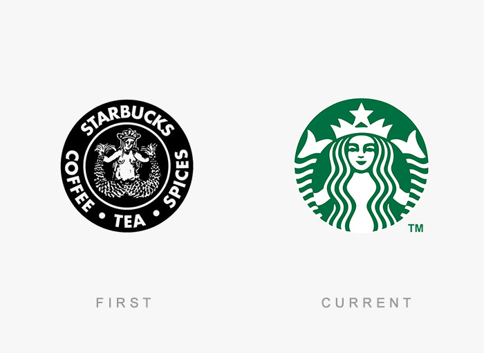
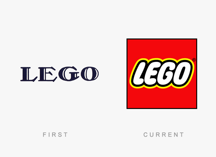
And there's no problem with a logo to go through itterations of itself over time.
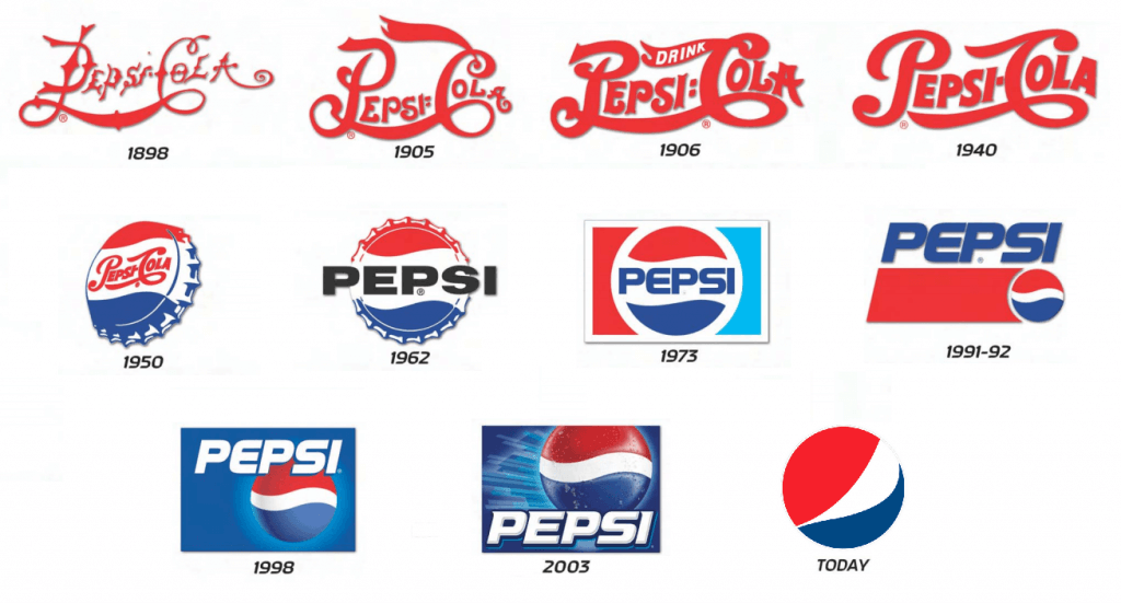
famous-logo-evolution-history-old-new-fb__700-png.jpg


famous-logo-evolution-history-old-new-27-5747099eadd44__700.jpg


famous-logo-evolution-history-old-new-9-5747097db47dc__700.jpg


pepsi-logo-history.png
 
I agree with every thing you say. I suppose my real issue is the use of just the house icon as this usually means ‘home’ on a small screen.

If you use just the D followed by the name of the company then you end up with DD
 
I agree with every thing you say. I suppose my real issue is the use of just the house icon as this usually means ‘home’ on a small screen.

If you use just the D followed by the name of the company then you end up with DD
Sure - these are problems and they do exist.
And you're right to bring them up.
 
Actually think the last one in the Pepsi logo is Korean Air.
Nope, that is the current pepsi logo.... yeah I know.

Korean Air is closer to a yin yang shape with a white gap going through it all splitting the shapes.... ironically closer to the old pepsi logo's than pepsi's current one lol
 
Did try but having the properties completely separate seemed to work best, so any other thoughts, am I good to go with this? Happy from my point of view but always good to get others opinions.
 
It works for me too, just make sure all your bits line up and gaps are the same etc. The first block doesn't quite line up with the left of the H in homes for example.

The only thing I'd maybe tweak is the top gap, visually it looks a little large compared with the bottom due to homes being there too.
 
Back
Top