You are using an out of date browser. It may not display this or other websites correctly.
You should upgrade or use an alternative browser.
You should upgrade or use an alternative browser.
Need help choosing a logo
- Thread starter John White
- Start date


Paul Murray
Ultimate Member
I think the final one is the most 'self-contained' in the sense that you have a name, textual logo, and a logomark, though I'd still tweak that 'W' a little. The others don't do it for me at all.
John White
New Member
Thanks for the feedback guys. @Paul Murray what tweaks would you suggest on the W?
Paul Murray
Ultimate Member
Thanks for the feedback guys. @Paul Murray what tweaks would you suggest on the W?
I'd remove the first part and just have it the same as the second part of the W – essentially remove the bar at the top, it draws the eye back towards the start of the logo, which you don't want.
I'd also reduce the tracking on the lettering too as it's a bit too wide for my liking. Generally the heavier the weight, the closer the letterforms should sit (this is where the lettering gets its 'heft' from). The opposite is also true of lighter fonts – space those further apart.
")
John White
New Member
Hi @Paul Murray. Thanks for the comments, all really useful. The top bar on the W is there because the idea was that it looked like a J and it was a play on my initials JW.
John White
New Member
@Paul Murray Do you still think it would be better removed?
Vanessa
Member
Hi John,
My first thought was that on the last 3 the font reminded me of JD Sports - having included a screenshot can see it's not quite the same side by side, but singling the JD at the front still makes me think of the sports brand.
My preference on the icons are I like the W with a cursor in, wondering if straight up looks neater - and without the top bar on last one I imagine it will look like 2 ticks which I think is more appealing than the attempt to incorporate the J.
I do prefer the font on the last ones but the sports thing sticks with me!
Attachments

John White
New Member
Hi Guys
Thanks for the comments.
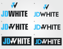
So I have tried a few more options based on feedback. I have tried different typefaces, looked closer at the tracking and tried a couple of variations without the top bar. Would be great to get your feedback on these updates.
Thanks
John


Thanks for the comments.
So I have tried a few more options based on feedback. I have tried different typefaces, looked closer at the tracking and tried a couple of variations without the top bar. Would be great to get your feedback on these updates.
Thanks
John
Last edited by a moderator:
Paul Murray
Ultimate Member
First one works for me. It looks much tighter with that font and reduced tracking, and I don't even mind the bar on the 'W'.
John White
New Member
Hi Guys. Im back again.I have done more refinement on the logo and come back with a few different options. I have tried an alternative with the logo mark outside the wording as a few have suggested it was confusing having it where it was. Would be great to get your feedback on this latest round.
Attachments

John White
New Member
John White
New Member
Great thanks again, always good to get another opinion.