Free Font of The Week

Yeah it looked pretty good! Why don't you post the logo up here for people to see the font in all its glory!
 
Another FREE font for you to all enjoy :)

This time we're taking a look at the solid Nexa Font, of which you can download the light and bold weights absolutely free.

nexa01.gif


DOWNLOAD ME HERE
 
Sean Lee-Amies said:
Another FREE font for you to all enjoy :)

This time we're taking a look at the solid Nexa Font, of which you can download the light and bold weights absolutely free.
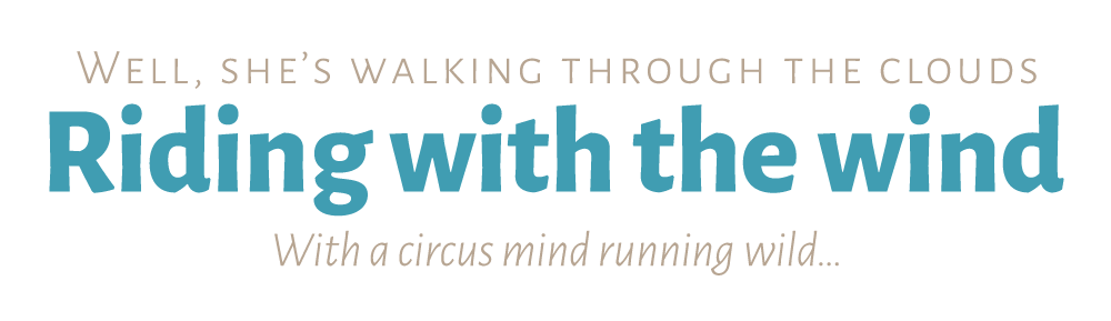
I was chuffed when I found this font a while back, it was perfect for a project I've been working on. Just not a fan of the lowercase 'g' though!
 
I really hate it when you find an awesome typeface and one character just looks rubbish and stops you from being able to use it.. although I usually just convert it to a shape and fix it myself :D I don't think the g looks too bad in Nexa :)
 
I usually do that too, its not awful - I don't think you could call the 'g' here rubbish like you can some others. I think its more of a personal opinion for me.
 
What's the worst, typeface destroying character you've found so far?
 
it's for those times when the client wants that special font and you just can't do it....
 
Haha, I haven't forgotten, just been too busy :( <--- lame excuse right there...
 
I have to say Nexa is great and I've been using it for my own stuff, so thanks a lot for finding it!
 
Back
Top