What is your opinion about my website design?

hollaboy

New Member
Hi there! :giggle:

My name is Edwin and I am a junior UI/UX designer with a small experience. I've been asked to create the website below. This is my first big and serious client and my best project thus far. Could you give me any pointers on how I could improve? Do you like it. I'm still a junior designer and looking for all possible feedback. Criticism is totally welcome. I've spent a lot of time on this client :)

I can attach some screenshots here. Desktop version:
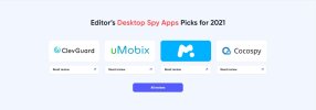
Homepage – RealSpyApps - Google Chrome 2021-09-01 07.21.20.jpg

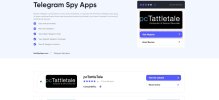
Best Telegram Spy Apps in the USA _ RealSpyApps.com - Google Chrome 2021-09-01 07.22.59.jpg

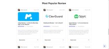
Homepage – RealSpyApps - Google Chrome 2021-09-01 07.21.59.jpg

And mobile version:

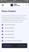
photo_2021-09-01_06-36-47.jpg

photo_2021-09-01_06-36-49.jpg

What do you think? I'll be glad to hear your opinion.
 
Last edited by a moderator:
If I'm being honest, it looks like you've taken a basic template and changed a few images here and there, it doesn't really feel professional either but it's a bit hard to put my finger on exactly what is causing that feeling..
 
I followed the link to the landing page and it's all a bit safe and boring. That abstract image doesn't work for me, unless I'm missing something it doesn't mean anything and it just
seems to be a random image with eyes. How about something more illustrative or photographic, or a character maybe? Probably been done before of course, but the obvious is
a character with a magnifying glass etc.

Also, that comma after Reviews isn't needed I think.
 
That abstract image doesn't work for me, unless I'm missing something it doesn't mean anything and it just seems to be a random image with eyes. How about something more illustrative or photographic, or a character maybe? Probably been done before of course, but the obvious is a character with a magnifying glass etc.
I assumed the moving eyes were to symbolise 'big brother watching over you'
 
I agree with the above it. If you're aiming for a minimalist x tech vibe, it doesn't make me feel it. But don't be discouraged, you can still further improve this. Wardy's comment on the illustrative part can be of great help. Also, try to make sure the images somewhat aligned with the other image (e.g pcTatelletale, looks too zoomed in)
 
The best way to build effective and attractive web layouts is to first know how to build effective and attractive print layouts.
 
I don't know, maybe im reviewing this a bit later and you've made some changes, I went to the website itself. I like the quirky images, abstract rounded images. It is a bit risky but it all depends on your target audience. I feel your font size is a bit small on your paragraphs. The layout does feel generic. like a listing website, I know technically it is.

It may be because of that that I don't feel like "what you are selling" is coming through strong enough for example look at the famigaurd website you have there.

Starting off with editors picks as a section is also not something im sure of. I mean showing your apps there is fine I would just play with different ways maybe a screenshot of the app or something like the actual app websites have, instead of the logo ( which you should make clickable).

I would also look at creating a categories section utilizing the brand names of the platforms that the apps are spying on. I would probably drop the mission and vision section for this and put the somewhere on an about page.
 
Back
Top