You are using an out of date browser. It may not display this or other websites correctly.
You should upgrade or use an alternative browser.
You should upgrade or use an alternative browser.
Taxi Business Card | Design | Feedback
- Thread starter 8th
- Start date


Katedesign
Well-Known Member
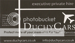
The font isn't very 'executive', and the logo (and I'm sure lots of us have done it) is a bit 'samey' - ie lots of people use part of an elipse as a logo. What message is it conveying?
Paul Murray
Ultimate Member
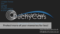
I think with this, less is more.
It should be simple and elegant, without extra 'fluff'. Something like this maybe:

Simple, to the point, and implies quality.
Look at the stationery designs for expensive hotels and restaurants to see how they often use simplicity to imply luxury.
It should be simple and elegant, without extra 'fluff'. Something like this maybe:
Simple, to the point, and implies quality.
Look at the stationery designs for expensive hotels and restaurants to see how they often use simplicity to imply luxury.
spottypenguin
Active Member
Pretty muh what has been said, Definitely change the font and if you 'must' use the elipse thing could you not manipulate it a bit and make it more of an abstract car form?
spottypenguin
Active Member
Also, don't know if you have done much design for print so if you know this apologies - watch your Quiet Zone for text i.e no text within 5mm of the edges
bluebeaniebelle
New Member
I like the roads and planes in the old one, maybe you could add a car on the line under the logo and a small plain flying on that blue eclipse thing?
It does look classy though")
It does look classy though