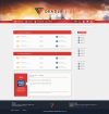
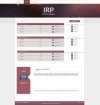
Showcase your website design skills! Anything you've done, old, new or just for you! Post it here!
You are using an out of date browser. It may not display this or other websites correctly.
You should upgrade or use an alternative browser.
You should upgrade or use an alternative browser.
SHOWCASE: Web Design
- Thread starter hankscorpio
- Start date
Paul Murray
Ultimate Member
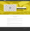
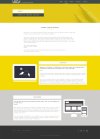
WhichStorage (not yet live)
YourParkingSpace (currently in the process of redesigning several key pages)
Here's a sneak-peak of a site for my rebrand (currently up to version 08 – should have something finalised by the time I'm 30, fingers crossed).

YourParkingSpace (currently in the process of redesigning several key pages)
Here's a sneak-peak of a site for my rebrand (currently up to version 08 – should have something finalised by the time I'm 30, fingers crossed).

Looks very impressive well done!
thegraphicguy
New Member
This is our current website design:
Image Plus
Image Plus
Baz_graffix
New Member
WhichStorage (not yet live)
YourParkingSpace (currently in the process of redesigning several key pages)
Here's a sneak-peak of a site for my rebrand (currently up to version 08 – should have something finalised by the time I'm 30, fingers crossed).
View attachment 2667
I like what you are doing Paul....
The which storage site is looking great carrying the colour of the storage unit doors through the site is a given :wink:
Before you go love though please do one thing...... Centralise the main image of the doors as there's more yellow to the left < of the textfield. Minor I know, but being obsessive, would drive me crazy haha
Paul Murray
Ultimate Member
I like what you are doing Paul....
The which storage site is looking great carrying the colour of the storage unit doors through the site is a given :wink:
Before you go love though please do one thing...... Centralise the main image of the doors as there's more yellow to the left < of the textfield. Minor I know, but being obsessive, would drive me crazy haha
Cheers for the input. The site's already built though so my work is done. The live site (http://www.whichstorage.co.uk/) has left-justified text though for some reason, which looks hideous with the gaps. I'd never justify text on a site just because you can't have the same level of control like you can with a printed column. Oh well.
@GCarlD
Well-Known Member
Cheers for the input. The site's already built though so my work is done. The live site (http://www.whichstorage.co.uk/) has left-justified text though for some reason, which looks hideous with the gaps. I'd never justify text on a site just because you can't have the same level of control like you can with a printed column. Oh well.
Not to mention the 'email' widow. But the site looks really nice. Great job!
searchandmore
New Member
We have just recently redesigned and but a fresh face on our website https://www.searchandmore.co.uk/
Opinions are always welcome
Opinions are always welcome
bigdave
Well-Known Member
Thought it was about time I revived this thread and posted some recent work:
The Rabbit In The Moon
The Man Behind The Curtain
York City Knights
The Rabbit In The Moon
The Man Behind The Curtain
York City Knights
I was part of the team making the design for this site https://vironit.com/
Hope you guys will like it
Hope you guys will like it
staunton_rook
Member
DesignersDownSouth
New Member
Hi guys, here's our current website, going through a lot of changes at the moment to refine and strip out the unnecessary!
Designers Down South
Designers Down South
Paul Murray
Ultimate Member
Are you affiliated with Designers Up North by any chance?Hi guys, here's our current website, going through a lot of changes at the moment to refine and strip out the unnecessary!
Designers Down South
DesignersDownSouth
New Member
Are you affiliated with Designers Up North by any chance?
Hi Paul, yes we are.
I see you did the S&S Logo, great work
bigdave
Well-Known Member
Here's one we've recently launched on the BigCommerce SaaS framework: ThePaperBox
Hi, thank you so much for your reply.Hi @FaribaH do you have a link to the site so we can see how it looks on a phone?
I've built the site locally, so don't have a link to share.
BTW, it's not a responsive site. It's the first website building project of the course, so the requirement is to build a simple website to start with.
It would be great to know what you think about the overall website from the screenshot I've attached for preview.
Many thanks & regards,
Fariba
fisicx
Active Member
It's a standard generic layout. Looks OK but nothing special.
Bin the whole yellow header area - it just takes up space and adds no value.
Make the font bigger and darker - it very difficult to read.
Don't make the video the showcase on the homepage.
The most important part of any website is the content. No matter how pretty the design, if the content is weak then the site will fail. So make the homepage copy really pop. Add images and links. Add an image grid linking to the inner pages. Add calls to action.
Put the menu on the left below the logo. Its much more intuitive. Note that a lot of designers like it on the right because it looks good but moving it below the logo it better because we read from top left - our eyes scan down the page not across the page.
Might be worth reading up on UI/UX - this will give you a much better insight into how people use a website.


