Review my new logo plz

djdany

New Member
Hello,
I am a website and graphic designer (not very professional). I have just designed my new logo but am not happy with the outcome. anyway designed a few and uploaded them here, so can you have a look please and comment it? Also I would now your suggestion about colour or general style.
Tnx
 

Attachments

  • logo.jpg
    logo.jpg
    100.1 KB · Views: 131
1 2 and 6 are decent
for me there's a fair bit going on underneath. the image and it kind of depends where the logo is for. if it's going on your site, then you don't need the url right?

the URL also confused me a shit ton! read it as 'mercades ign' but that's probably just me being a derp :p
 
Confused.com?

Whats the story behind the logo, what are you trying to tell us about yourself through the logo.??

• The brand identity should represent values, service, concept and the personality.
• The brand should go way deeper than just a distinctive font and powerful colour Scheme.
• The brand should be a symbolic embodiment of all the information connected to the product and serves to create associations and expectations around it.
 
I think 1 is the best one. However, I agree with everyone saying that they're all quite busy. Do you need to have your website underneath your name? If the logo is going on a flyer or a business card then you could put the URL somewhere else =)
 
Thank you for your posts, I realized that it is a busy logo, that's why I am not totally happy with the outcome. Can you tell me what item made it busy in your opinion? I personally believe that the wing is the busiest part but it is the core of my logo and I used that as a symbol. (So maybe I need to change the whole logo??)

also I have no idea about putting my website address under the logo, I just did that because I have seen other logos are like that. Anyway I think it is necessary to be there when I place my logo on a poster or a brochure, but of course not for placing on a website.

So if you have any idea in general about my logo, please let me know.

Many thanks,
Danial
 
For me the problem with it at the moment is that it does not relate to your brand, the fact that you are a website and graphic designer.

What are you trying to portray through the wing??

Try to address this problem first and then a more concise, less hectic solution will arrive via the design process.
 
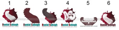
It seems to me that you have decided you like the wing, and tried to make it your logo, but as others have said, you need to start at the other end - deciding on what you want to portray and going from there, not finding an image and trying to make that fit.

If you feel the wing really fits you/your company then I would look at ways of simplifying the wing. I would work in black and white only until you feel the logo is great, then it's time to start playing with colour. Remember this logo may in some situation need to be seen really small, and then at the opposite end of the spectrum, really big! So you need to design something that works in all scenarios.

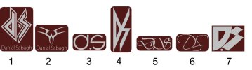
As others have said, no need for the web address but I am confused somewhat - would your company name (not your name) be the thing to put under the logo? Either that or your name should be in the web address too. I can just see people struggling to find you on google for example - would they search for your name or the name in the web address? If they searched for either would they get similar results?

I must add that I'm not a fan of the colours you have used, reminds me of blood - is this what you were going for?

I'm also not sure about the kind of cracked background graphic - for what reason are you using this?
 
Nothing wrong with a wing if that's what you want to go with but it is too busy. Have a look at the wing element of the Detroit Redwings logo for a better interpretation.
 
For me the problem with it at the moment is that it does not relate to your brand, the fact that you are a website and graphic designer.

What are you trying to portray through the wing??

Try to address this problem first and then a more concise, less hectic solution will arrive via the design process.

Thanks for your comment, I chose that wing because it is related to my background and the country I come from and that's a kind of basic art.

That was the reason I chose the wing but now I see it is just too busy and I am about to forgot the wing and look for another image.

Thanks again,
 
Thank you people, as you mentioned before and also according to my research in last a few days, I think my logo is not really professional and I am looking for new ideas to create another one.

I would leave the wing as it is hard to simplify it and so I would use another image.

Anyway thanks for your comments and if you have any source or any website to get some ideas, please let me know.
 
As I was testing my name in different fonts, I chose a few of them and by a bit editing, they look good for being logos. But I am not sure that is it legal to use a font as a logo?
Have a look at the attached picture and tell me your opinion ? I know they are not a proper logo but by a bit editing on Illustrator, they can be;)
I think they are simple and memorable. So what do you think ??
 

Attachments

  • DS.jpg
    DS.jpg
    58.2 KB · Views: 22
Last edited:
Just out of interest, where do you see yourself as a designer? We obviously don't know much about you so what is your experience in web and graphic design?
 
I think your first idea of using the wing was better. These new ones are pretty lacking.

With regards to the wing, I like number 2 if it was simplified (reduce the number of feathers for example) and lose the text for the time being. The logo needs to work on it's own without text (that's the point of it).
 
Just out of interest, where do you see yourself as a designer? We obviously don't know much about you so what is your experience in web and graphic design?

I am not a professional designer, I have only 1 year experience in graphic design and 3 years in web design. At the moment I am trying to make my works more professional and also I found my interest is in working for artists, such as singers. I think I have more talent in this industry. So that's some info about me.

About designing my logo I am trying to create something relevant to my work and aim, but to be honest I never stuck like now, I have no idea about my logo. I've seen hundreds of examples but non of them worked for me. Maybe it is better to stick to the wing? do you have any Idea to make it more simple as it is?

TNX
 
I would consider the comments made previously and start again. Consider the image you wish to communicate. Ask a few potential clients for feedback - what do the logos convey to them?

Currently... I would not use any of them... but you'll get there. Research first.
 
I am not a professional designer, I have only 1 year experience in graphic design and 3 years in web design. At the moment I am trying to make my works more professional and also I found my interest is in working for artists, such as singers. I think I have more talent in this industry. So that's some info about me.

The reason I asked the question is that you can normally tell the experience of a designer by the simplicity used to get the message across in the work they produce. I always think the more detail, the more it looks like clip art and I'm getting that here.

There are ways of producing exactly the same message but it needs much, MUCH more simplified artworking. As you get some work under your belt this will become more and more apparent to you and how you work, because I would also guess that you have gone straight to computer to make these logos.

Please don't take offence at what I've said because we've all had to start somewhere, but like Minuteman has said I would go back to the drawing board, have a think about what image you want to give and sketch out some ideas. :icon_thumbup:
 
I agree with a lot of what people have said but I personally can't see what is wrong in using a wing for a logo IF you employ it well. It has connections to your background and can have some sort of strapline about creativity soaring blah blah kind of thing.

That said do go back to the drawing board and have a thunk :icon_thumbup:

have a look through some of these and see what these people have come up with, they aren't all necessarily good but you'll see it in practice wing logo - Google Search
 
Back
Top