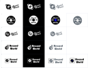
Hello, I am in the process of re-designing my logo ideas for Record World (a fictional company). I would like some feedback prior to starting, and perhaps a few ideas.
Here is the brief:
"Record World is one of the last big record stores in LA. We are famous for our variety of music and we are well-known among famous musicians and celebrities who regularly visit our store. We used to have two more stores in the US but sadly they didn’t work out and had to close due to financial issues. This is why we want to revamp our main store in LA so we can attract more customers. We want our new logo to keep our vintage style but we want to do more in terms of social media and stuff like that so you’ll have to keep that in mind.
We’ve been seeing that vinyl records have become extremely popular again lately. This is also why our main store in LA is doing much better right now. We want to begin focusing more and more on vinyl and want our logo to reflect that. We really like the logos on some of these old vinyl records that we sell in our store. I’ve attached some pictures of our vinyl records that I’d like you to base the logo design on. Would you be interested in working with us?"
After a bit of research, I think I should focus more on the LA music scene. Surf rock was popular in the 1960s. Every vinyl record is different so I think it would be difficult to capture everything in one logo. I didn't know what colours to use, if any, in my designs below. There doesn't seem to be any consistency with record stores as they are all different. I'm now thinking red, yellow and orange might be suitable, to capture the California vibe. Thank you in advance.
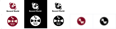