Rate my logo

peteygt

New Member
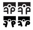
Hi guys, I would really appreciate some feedback on this logo I'm designing. Its for the Family intervention Team I work with. They work with troubled families in the area and help to return some structure to them. Here are some of my final ideas.

Logos attached,

Cheers:icon_smile:
 

Attachments

  • fip logo 2 copy.jpg
    fip logo 2 copy.jpg
    47.7 KB · Views: 41
hi pete, what is the name of the company/group. I'm struggling to see what is going on with this, have you reversed the letterforms?
G
 
The name of the group is FIP (family intervention Project). I reversed the letterforms for the F. The idea is that the 'I' makes a person who has their arms around the other letters but perhaps it's a bit tenuous :s
 
The idea of the surrounding/supporting arms is good and I like the top left version best. How about curving the crossbar of the f up slightly, and putting a small gap in where the curve of the p meets the ascender? It might give it a little more balance but you'd need to make sure the f and p where still recognisable as letters.

Just an idea.
Mary
 
Back
Top