Chris Wiltshire!
Member
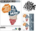
Here I have done a poster and ticket design for an African charity called Kotu for free, I was asked to keep the theme on africa and to design something that was colorful/clean and appealing to the young and old.. and so I did by using the African map, african colours and a clean/readable font.:icon_biggrin:
I have also got to do a programme for the event and so my aim is to keep everything tied together..there is one or two words that I have to change.
Any tips would be appreciated.:icon_biggrin:

Uploaded with ImageShack.us
I have also got to do a programme for the event and so my aim is to keep everything tied together..there is one or two words that I have to change.
Any tips would be appreciated.:icon_biggrin:

Uploaded with ImageShack.us
Attachments
Last edited:
