please critque

kberry21

New Member
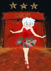
i am currently experimenting with illustrator and photoshop, the main focus of the image needs to be the person and her clothing, she was originally in line and then filled however i feel she looks flat where the block colours are. The piece of work is based on a circus theme and the pieces of artwork i aim to produce are essentially advertising fashion clothing so it touches on fashion illustration. please let me know your thoughts.
(the background image is not high quality and would not be used in final artwork production)
thanks even if you hate it :)
 

Attachments

  • girlclown.jpg
    girlclown.jpg
    89.2 KB · Views: 35
i am currently experimenting with illustrator and photoshop, the main focus of the image needs to be the person and her clothing, she was originally in line and then filled however i feel she looks flat where the block colours are. The piece of work is based on a circus theme and the pieces of artwork i aim to produce are essentially advertising fashion clothing so it touches on fashion illustration. please let me know your thoughts.
(the background image is not high quality and would not be used in final artwork production)
thanks even if you hate it :)

Although I would agree with you that she looks a little flat, I'd say that's more in comparison to the background and perhaps doesn't really harm the overall piece due to your intention of making her the focus?

I mean, the fact that she seems flat does make her stand out most in my opinion, which would be as you wished.
 
It's difficult to identify the clothing as the focus when it's so similar in colour to the background (practically disappearing at one point).
 
i am currently experimenting with illustrator and photoshop, the main focus of the image needs to be the person and her clothing, she was originally in line and then filled however i feel she looks flat where the block colours are. The piece of work is based on a circus theme and the pieces of artwork i aim to produce are essentially advertising fashion clothing so it touches on fashion illustration. please let me know your thoughts.
(the background image is not high quality and would not be used in final artwork production)
thanks even if you hate it :)

I would say it would have been better to have had a more vivid contrast between her dress and the background.
 
It's difficult to identify the clothing as the focus when it's so similar in colour to the background (practically disappearing at one point).

That's correct - I never noticed the need for clothing to be distinguished, just her!
 
Personally I'd lose the background completely, maybe have it a solid colour, the same colour as her skin (but keep the outline around her body parts). I'd also reduce her in size a bit to add more space above her. It feels a bit cramped at the minute.
 
Back
Top