Please critique my website

Portland Guitar

New Member
Hello,

I am a guitar builder and my website is set up for two purposes, it showcases and highlights the guitars that I build. The other part of it is to act as an online store for buying these guitars. I'm trying to strike the balance as best I can. I think I'm missing a few visual elements that could make my site more appealing. Right now I'm focused on keeping the page light and fast. Here is the page: guitar luthier. Any feedback is super helpful!
 
Honest first impression... it looks boring and dated. It doesn't really fit the market you're trying to sell to imo either and if it wasn't for the fact I knew what the site was for in advance the first thing it says to me is it's a 'personal site' for someone who likes guitars, rather than a business.

You say you make custom guitars, I'd be expecting the site to be more 'artisan' design with focus on the guitars rather than the 'founder' if you get me, putting an emphasis on the custom work you do rather than who does it.
 
I agree with Levi.

It's not bad for someone who doesn't do it for a living, I presume.

But maybe you could trade a custom guitar for a website design?

Just a thought!
 
absolutely. This was one of my considerations with my first editions. Currently my problem is that I can't use a lot of images because it slows down the website speed. Which is why I moved towards more text. But you're feedback is spot on.
 
Further to the above, the photography is awful. You don't need to get a professional photographer, but there are lots of hints and tips online for better product
photos, or find a friend who does it for a hobby maybe. If you have better images, find out how to make them small enough not to slow down the site.
 
the files are as small as they can be. what is bad about the photos? I'd like something a little more helpful than just the fact that they're awful. I know they're bad. I don't need it to be reinforced that they suck. That's why I'm here
 
the files are as small as they can be. what is bad about the photos? I'd like something a little more helpful than just the fact that they're awful. I know they're bad. I don't need it to be reinforced that they suck. That's why I'm here

Good point - it is hard sometime to remember that we know more than you - we just assume we are all the same level.

You are right.

Your images are quite large in file size.

In Photoshop - go to File>Export>Save for Web Legacy

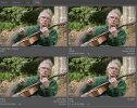
You get this - and I selected 4 up from the Tabs on top.

Your original file is top left - and I've selected 3 other image types to save as - GIF, PNG 24, JPEG
The Images have the name of the file underneath, and the size when saved using this format.

GIF would be ideal for this type of image, as it has a limited colour pallete anyway.

But by and large - your ideal image is the JPEG - it cuts down your original from 952K to 44.24K.
1604149398000.png


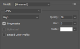
On the right you see the settings - click on the JPEG image to select this as it's the smallest file size.
And these settings are fine for a website

1604149632174.png


If you don't have Photoshop - then most image editors have the same settings for images.
 
If you know they're bad, then like I said, find someone who can take better ones or learn how to take better ones yourself. There must be lots to tutorials online.
Find better backgrounds or just stick a piece of white board behind them or something, and better lighting etc. I'm thinking more of just the main photos before they
get clicked on. At the moment they just look like something on an Ebay sale. Only my opinion of course.

As regards size of photos, someone else more qualified will tell you how best to upload them without slowing down your site.
 
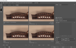
Again - another image - bottom right is the optimised - compared to your original

It reduces your image from over 900k to about 50K - quite a difference.

Untitled-1.jpg
 
If the purpose of the site is to sell guitars get rid of everything except the products.

The images don’t slow down the site, cheap hosting does.

Agree the site looks dated. You sell quality products, spend some cash getting a quality site built by someone who knows what they are doing.

Nobody cares about you. People land on the site because they want a guitar not to read about you.
 
I don't know if I want to see professional photography of a custom made product, I like the wholesomeness of it all, being home made, and a decent photo, lends to the charm.

The website is terrible, photos overly file size heavy, and needs a more caring hand in the design of the sites.

I'm not a website guy, so apologies I can't tell you how to fix it. But hopefully my tips on the photo sizes helps in some way.

Again, I think trading a custom made guitar for a website would be the way to go.
 
absolutely. This was one of my considerations with my first editions. Currently my problem is that I can't use a lot of images because it slows down the website speed. Which is why I moved towards more text. But you're feedback is spot on.
No idea what you're browsing on speed wise but you can go more picture heavy than what you have and still be ok with the file sizes.... especially as you're using lazy load meaning it should only load an image if visible.

Again - another image - bottom right is the optimised - compared to your original

It reduces your image from over 900k to about 50K - quite a difference.
That image you used was loading as webp on firefox and was around 76k for me.... looking at the code they've got different versions listed and the browser picks the first one it can access (more commonly done with video's than images).

Just change them all to a web optimised jpeg.


As to the actual photo's, I wouldn't go down the professional route either but I they could be improved... think better lighting, better staging such a guitar resting by an open fire (yes I know the safety aspect but it's a photo), have it resting on the table with a nice bottle and glass of whisky etc... give then some 'life', think about the type of person the guitars appeal to etc. Not saying having a clean white background isn't a good thing for the store but for the main site they just needs some 'life' imo.
 
That will help but the whole site structure is wrong. I’m not even convinced the whole e-commerce thing is right.

If I’m looking at your products It because I want something special not mass produced stuff.

This means making it much more personal. Really push the uniqueness of the guitars. Don’t have thumbnails at all. Put up full sized galleries and weave them into the story.

There is a great marketing phrase: sell the sizzle not the sausage. Your job is to make me really want to place an order. You do this through words and pictures.

Getting professional help would still be my suggestion. If nothing else, they can advise on how to take great pictures.
 
That's true. I sell guitar bridges that sell for $60 each, that's the main purpose of the e-commerce part, not everyone wants to message me for the product. Site structure has been a big problem for me. I'm trying to fit a few different websites into this one, an an e-commerce site to sell guitars and parts, the manufacturing site to explain them, and a blog to attract viewers to the website. I haven't been able to figure out which to highlight.
 
This opens up a whole load of new questions.

How are you marketing the bridges?

Who buys your guitars? How are you marketing the guitars? Are these the same people who buy the bridges?

The manufacturing process is background content. The blog isn't needed. In any case they aren't focused on marketing the guitars. This post for example: https://www.portlandguitar.com/blogs/shop-creations/how-to-bend-wood You don't allow me to comment not do you add a call to action. People who want to know how to bend wood aren't the same people who want to buy a custom guitar.

The gallery is just a bunch of random images. You have no captions or links to products.

If I'm spending $4K on a guitar I'm not going to do this without talking to you first to make sure its the right one for me. Which means I want to see full sized images. Hi-res and as big as you can make them.

I'd reconsider using Shopify - it's turned something special in to a commodity. It's as if you are selling socks not something custom.

Question: to you make these to order or you have a warehouse full of pre made guitars?

If I'm paying $4K for a guitar I expect free delivery. And why does it take 10 days?

There are no T&C or returns policy

How can I pay with a bank transfer or Credit Card?
 
The bridges are targeted to guitar builders which is why the blog has articles about guitar building. The people looking to buy guitars are mainly men over 30 who are upgrading, there are some gigging musicians and many collectors of various seriousness, of other high quality guitars.

The website structure isn't tight, many of the pages don't serve the same customer. Many people do send me questions about custom guitars. my page here:
https://www.portlandguitar.com/coll...ught-in-east-indian-rosewood-and-sitka-spruce
shows how you can buy one, with the pictures. You're right that I should make my returns policy clear.
 
That's true. I sell guitar bridges that sell for $60 each, that's the main purpose of the e-commerce part, not everyone wants to message me for the product. Site structure has been a big problem for me. I'm trying to fit a few different websites into this one, an an e-commerce site to sell guitars and parts, the manufacturing site to explain them, and a blog to attract viewers to the website. I haven't been able to figure out which to highlight.
It might be worth having two or maybe even three websites then.... while it might seem like more work it might in the long run make life easier if you expand from say guitar bridges to other guitar parts for builders.

Might be worth considering having a blog site at say portlandguitar.com (advice, articles that type of thing with regular updates along with social media), then having two other sites, one which is purely a 'sales portal' for your bridges (say portlandguitarparts.com to cover any possible expansion of items you sell) and then another site which is purely about your custom guitars (portlandcustomguitars.com).... match the branding/feel etc on them all and make sure there's some cross linking between the sites.

Another option is maybe having a home page with basic information to help get search engine there then have some big in your face type links to each part of your site... something like the below although I think personally I'd do the three different websites (you can get a multi site hosting packages so the cost isn't going to be that much higher to host per year)

portlandguitars.com - intro etc
- portlandguitar.com/store - the store part
- portlandguitar.com/blog - regular updates
- portlandguitar.com/customguitars - custom guitar stuff
 
Sorry for being negative here and probably not what you want to hear, but my take would be to get someone who knows what they are doing to design and build a site that both functions well and tells your story, visually.

That way, you will more than likely make more sales than going with the DIY website. In the same way, if I want a new guitar, I would be ill-advised to go into my shed and make one with no knowledge or experience.

If someone doesn’t have the first clue how to make a guitar, what they produce is very unlikely to be a good instrument.
 
Back
Top