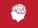
Personal logo concept

Paul Murray

Ultimate Member
What's everyone's thoughts on this as a logo design for yours truly? I'm aiming for 'personal', 'creative' and 'some kind of indication of what I do as a designer'.

535034572.jpeg


Obviously the execution and a few little things need tidying up, but as an idea how is it?
 
I've dropped the weight on the text down and printed the whole thing at about 15mm squared and you can still make it out (though the spacing probably needs adjusting still.

It also looks like it's been drawn with a fineliner which is a bonus :)
 
I like the concept Paul. How about just using your initials in the "brain" and making them look err brainy?:icon_biggrin:

Something like this? then having your name underneath the head?
PMlogo.jpg

That way you force potential clients to read your mind before you spend your career trying to read theirs! :icon_biggrin:
 
I like the idea mate. I wouldn't worry about resizing, because other than a business card, it's not really going to get any smaller. The red version is roughly the the size of a card and looks very clear to me.
One thing though, the brain and lettering looks a lot more detailed and intricate than the outside shape of your head. Can you get any more detail in there? Some bits of hair, or your fake beard?
 
Cheers guys.


I do like that, and I did want to have a 'brainy' look to the type, though I'm not too keen on using PMD. Saying that though, it does look really good :)

One thing though, the brain and lettering looks a lot more detailed and intricate than the outside shape of your head. Can you get any more detail in there? Some bits of hair, or your fake beard?

I was planning on adding some tufts of hair at the back and a bit of definition. I want to have the profile as more of a caricature of me.

I'm looking into try Moo's 'printfinity' feature where you can have multiple backgrounds on your cards. One side would be the standard details and logo, the other side would maybe be the profile reversed with something different in the brain. Maybe something pretentious like an impossible shape, though a lone fly buzzing around would probably be more appropriate :p
 
I really like the concept and I like your execution. Like Ross said, I'd stick a bit more of yourself into the silhouette and wham bam, you've got a winner.

Let me know how you get on with Moo, I'm about to get some cards made too and was wondering if I had a use for their Printify service.
 
I like the concept of this but I'm sure I may have seen this some were else before but can't think were this is going to bug me now.

Iain
 
Yeah, I'm seeing this idea everywhere I look now. My friends think it's hilarious to point out similar looking designs and stuff. I'm hoping that I can still get away with it as it's the only idea I've had that I'm happy to use to represent myself. Hopefully having different things in the space inside my head can help it stand out.
 
Looks like the kind of thing you might see pinned to a noticeboard in the doctor's waiting room: put the word 'depression' in place of your own information and there you go.
 
Looks like the kind of thing you might see pinned to a noticeboard in the doctor's waiting room: put the word 'depression' in place of your own information and there you go.

That in itself has just made me depressed :icon_frown:
 
Yes I knew I had seen it before it is always used for healthy living or better living I knew I had seen it somewhere
 
I'm starting to think that this is just too naff to use for a logo, especially as a designer.

I'm really struggling to come up with something I like, and I don't think my name lends itself to a monogram/symbol. My name just doesn't seem to look right as a typographic logo either, to me at least.

Toughest brief ever! :icon_mad:
 
when i was doing my BA a few years ago one of my briefs was to design a logo for my name and i must say its the hardest thing to do as u want it to be perfect but then when u think u have got it, u see the light and go ffs i dont like it now. i no your pain lol
 
I want to take advantage of Boss's business card offer and since I'm gonna be giving them out to people in the industry, I want something that's not going to be instantly laughed at. I also want something that will look creative and impressive to clients.

My name doesn't even look good in Helvetica so I think I'm fucked.
 
Designing for yourself is always a nightmare and creating a logo for someone in the business of graphic design multiplies that nightmare by a factor of ten. When I was working on my own brand, I was probably thinking along similar lines to you and ended up choosing what I thought was a nice colour palette, wrote the name of my business in what I thought was a nice font and added a device based on a thought bubble in subtle shades of R, G and B. Massively original? Not really but it still pleases me aesthetically three years on because I set out to demonstrate simple ideas in a way that was pleasing to my eye: show that you understand colour, shape and typography, don't get mired in detail, be generally happy with the result and get the hell out of there.
 
Back
Top