StephenSanity
New Member
Hello, I am an Industrial Designer designing a personal logo/ monogram and graphic identity for use on my website, CV, business cards etc..
Really appreciate some advice from you graphic gurus.
Brand: S C Design
In addition to the basic traits of a good logo, the goal for the project is to represent my work as an industrial designer.
After brainstorming I selected these key traits of my work to convey in the logo:
- sophisticated/ modern
- simple/ iconic
- symbolize creativity/ design work
- a touch of sci-fi
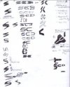
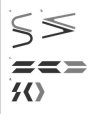
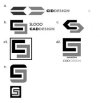
sketch directions:
1.] "C" and "D" stacked vertically to create an "S" . . .C and D shape are abstracted from pencil tips, like the pencil tips to represent my work, but gut instinct are pencils are cliche' designer logos..
2.] Slanted rectangle repeated to create initials..like the repetition of shape, but lacks the content of symbolizing creativity
3.] Negative space C and D appear as a spaceship..but no solution yet for integrating the S in the symbol...like the sci fi aspect...needs more sketch ideas
this was the first round of ideas..already thinking I should start at the beginning of the process again..
