You are using an out of date browser. It may not display this or other websites correctly.
You should upgrade or use an alternative browser.
You should upgrade or use an alternative browser.
Opinions Please
- Thread starter ednuttall
- Start date
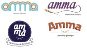
In terms of reproduction, especially in screen printing - the tiny needle holes and the dots, etc. nightmare in production.
The worst I had to print was a TM symbol at 4pt - and that was touch and go, page by page had to be checked.
What I think is that they detail could be too complex for various reproduction techniques.
The worst I had to print was a TM symbol at 4pt - and that was touch and go, page by page had to be checked.
What I think is that they detail could be too complex for various reproduction techniques.
Katedesign
Well-Known Member
I prefer top right... but on all I would suggest making the 'Alterations & Boutique' larger so that it is still readable at a business card size without making the logo massive!
Don't understand top left?
Don't understand top left?
