Ouch ! Hehe that's ok guys I was half expecting it.. Yes it did take about 3 hours from start to finish, make two letters, convert to points, move points around, map 'erceptions' to a curve... maybe with some YouTube/web pauses in between while I learned about changing letters to vectors and what-not. I've been in IT for a long time, just not design ! (Obviously by the sound of it haha)
Some of you seem a little butthurt that I have the audacity to attempt such a thing.. Which I can understand to a point.. ! That said, there is something for me in being entirely responsible for this and every other aspect of my business, never hired in help..a Doubt I ever will.. My last business was started with £1400 and got to £350k turnover before I sold it on, the only outside help I got was with accounts and radio advertising ! Yes, I'm stubborn and self-sufficient !
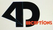
It's not that I won't listen to your advice guys, some of it is useful, like about font and scaling of the logo.. If the 4 reads like an L I'll adjust it so it doesn't..
I understand what negative space is, and spent a couple of hours with a pencil before I switched the PC on, lots of assumption going on..
I realise it's not a professional logo, but it's far better than a lot of the logo's I have seen on other similar sites, I came here to ask how I can take it from where it is to where it needs to be, it's a simple image.. Not rocket science !
Levi, you own Adobe?? No I wouldn't out my UAV in someone else's hands, as it costs a lot of money if they break it.. How does that relate? I would certainly encourage them to practice and not simply condescend to them that they should only ever consider an experienced pilot..
")
fair final question.. The 4th dimension in this sense is time, as footage/stills can be taken from the same gps coordinates over days or weeks, and of course time-lapse is available.. So I think I can scrape it
So I think I'll make sure the 4 reads as a 4, change the font for the 'erceptions' letter and maybe run it along the bottom, flipping from white to black as it leaves the confines of the D. I'll keep tweaking it and try to make it approach something a little above outright amateur.. !
I do appreciate your input on how to improve/alter the logo..
Have a good day y'all


 Hi Guys, first post here.. About my first Logo..