New logo idea...

bigdave

Well-Known Member
I've been toying with this for a couple of days now and wondered what the general opinion was? I'm looking towards a minimalistic simple design that functions well on it's own but will also adapt well in different situations (eg, sinage, stationery, web etc...). My current concern is that at small scale the wording around the edge would become illegible.
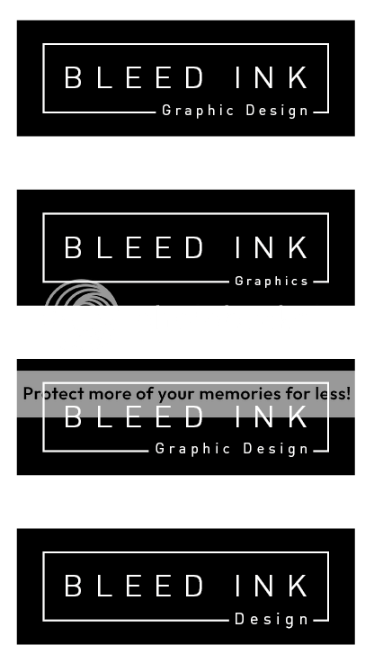
Screenshot2011-10-26at224336.png
 
Fairly neutral response here but it does kind of look like something you might see sewn inside the collar of a shirt.
 
I've been toying with this for a couple of days now and wondered what the general opinion was? I'm looking towards a minimalistic simple design that functions well on it's own but will also adapt well in different situations (eg, sinage, stationery, web etc...). My current concern is that at small scale the wording around the edge would become illegible.
Screenshot2011-10-26at224336.png

Have you tried having the secondary text in uppercase as well? It might balance a little better? Personally I like it as I'm a big fan of simple designs as they always work!! When I first saw the name I thought that's a cool name for a tattooist though.
 
I'm not keen on the secondary text line. It feels very uncomfortable to me. Could be that it's too big, or because it cuts over part of the box - not sure.

I'd try removing it, keep the whole box there and replace the secondary text line under bleed or ink again. Don't you do print as well? If so I'd probably have design & print.
 
It looks like the Primark Essentials logo I think?
That doesn't stop me liking it though, maybe try centreing the subtext?
 
It looks like the Primark Essentials logo I think?
That doesn't stop me liking it though, maybe try centreing the subtext?

I think centering the subtext and capitalising would look better... I don't know what your thoughts are but what about making a ink blob on one corner? (I mean just the shape)

Just a thought though.
 
make the word graphic design smaller and put it underneath the box and space (tracking) the letters out so that is the width of the bottom, try it in capitals too. :icon_smile:
 
Who or what an earth is Professor Green?
They'd be a tiny bit similar like, although,

primark_essentials.jpg


That too is also fairly similar?
 
Perhaps you should look back at what imagery 'bleed ink' brings to mind? I know you've got the white inner keyline representing the trim area and that outside being the bleed, but perhaps the section where you have 'design' or whatever is in fact a hole where ink is bleeding out?
So potentially the inner section is full red ink, leaking or pouring out of the gap...
 
I don't think the primark logo is anything like my design. The similarity ends at the fact that they're both typographical. Professor Green is a hip hop, rapper type musician (not really my thing tbh).
 
I think the thing here is that what you have is basically text in a box and that will draw comparisons with loads of other stuff as it's such a simple, basic approach; whether it's the same or not, it's inevitable that it will put people in mind of something they've seen before.

I also do not consider simple and basic to necessarily equate to 'minimalist': I think successful minimalist design has an idea at it's heart and that that idea is then stripped down to its essential elements but I'm not honestly sure that text in a box is really much of an idea.

Please don't go down the drippy ink splodges route but this needs something if it's going to stand out from the crowd.
 
Well me, my budgie and my dog all think it's fairly similar, so surely we must be right?

In all honesty, nah, I guess it's not, typographical in a rectangle, that's probably it. Just reminded me a little of it though.
 
Personnally I tend to agree with Dave. I think its a little, dare I say, boring at the minute :S And I agree that blobs of ink would be a bit predictable. Its so hard to design your own logo. I have been trying to come up with something for months and I keep reverting to simple typo Logos with no real aim as I can't pin down what I want to convey yet....Pain in the Butt! I really like your current logo though. Is there are reason you are updating?
 
The existing logo it's self is a nice piece of design but as time goes on, I've realised that it's form is somewhat cumbersome and doesn't fit well into many situations. As for the company colour, I worry that the vibrant red maybe leads to too much negative emphasis on the word 'bleed'.
 
I agree that the word Bleed and the colour red could evoke a negative feeling, but I still like it! Changing the colour will help that but wont take it away completely, as the word bleed is still there. Also your logo atm will appeal to other designers or people who know what 'Bleed' is in a design context but it will mean nothing to 'outsiders'. But just because they might not understand it doesnt you shouldn't use it but it could mean you might need to come up with something that is clever (using the 'Bleed' in a design context) but still appealing and memorable to look at for people that don't see the world in the way that alot of us here see it.

I like it and think others will be drawn to it but it does have the problem that your logo (the one as your avatar) doesnt say bleed. So as 'normal' person if I saw your business card or anything I would google/ refer to you as 'ink' rather than Bleed Ink? Just a thought which Im sure your aware!

Jesus, Im bad at explaining myself! Words are not my forte, Im in no way an expert either lol, so this is just my, maybe slightly warpped opinion! :S
 
You've called yourself 'Bleed Ink'. It's a pretty bold name. To then wuss out and not use red because it might be a bit scary is missing a trick. If that's the name you've chosen, go the whole hog and make it work. And I'd even include using some kind of splodges/splatters/handwritten type etc (Olicana rough would be cool) in that, to a great or lesser extent. It could be as subtle as a small single droplet coming from one of the letters. Or forming the dot on the i. Like I said, that's the name you've chosen - make the logo reflect the name. And if the name doesn't reflect you and what you do, change the name.
 
Back
Top