New Logo Design.

Vanquish

Member
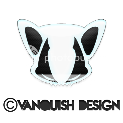
I have been thinking of a new logo design for myself, just thought id share with you all what i have come up with. im not sure if to keep it this shiny glass effect, or to give it some armour or something, im currently drawing up a cartooned version also. Though i am scared if i make it too cartoony it may look like a pokemon.. Take a look :)
imglogo.png
 
I quite like it but I'd remove the effect, the copyright mark and the stroke, and maybe invert the black and white.

I'm personally not a fan of characters that have had their counters removed, it's trendy and makes type hard to read. You also need to kern the text :icon_smile:
 
I like the illustration, that seems to be a great strength of yours, but I would agree with Paul that the typography needs work, I too am not a fan of that kind of font, and I'm not sure the treatment of it matches the logo. I would go for something less fussy in terms of the style of it, and yes, definitely lose the copyright symbol, it's unnecessary and whackily over-sized.
 
I love the character and agree with the others that your illustrations are very good. One question I would ask is target market? If you are designing for gamers, for instance, then perfect but am not sure it would go down well in the corporate world.
 
Thanks to you all for commenting, the fonts and the copyright is only there for when i uploaded the picture it isnt full time. its just the logo itself. :)
 
Is the image anything in particular? It doesn't obviously represent anything specific for me... consequently I kind of see a pelvic bone (which I assume it isn't - and if I were to commit to type the stuff that follows I can see m'self falling prey to all kinds of shady amateur psychology which, if it's okay with you guys, I'll pass on).
 
nothing in particular, i used to have a Hound as a logo called Vanquish Hound. Its more like a made up mascot logo i like to use, when offers are on i can use the logo name as the promotional code etc.
 
Back
Top