New Logo Design

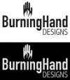
Really like the way I've got it looking now, think the flames work well to replace the dot above the i, looks like it could be a match setting fire to the hand and it incorporates the hand just as well.

Not sure this is the right font but do like the tall slim lines...I've got a ton of fonts to go through, I want something technical and modern.

What do you think?
Do I have the proportions right?
Are there exact 'graphic to text' proportions to follow?
 

Attachments

  • new-logo-text.gif
    new-logo-text.gif
    4.5 KB · Views: 9
Maybe you could try the word 'Designs' as all caps - at the minute this looks too small.

Have a look through font squirrel for other font alternatives just in case there's something more suited to the logo.
 
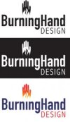
I think I am done, well done with the design of the various elements, now I've got the colour to sort out :)

Could it be better? Probably, but I have spent weeks going back n forth with different ideas (there was a lot more before I posted here!) and making adjustments over and over, from the sketch pad to PC and back, from scanning and live tracing to printing and hand tracing and I really do feel that I have done as much as I can do and I really think it works as it is so I'm very happy with what I've achieved...

I went to fonts.com for the 2 fonts I decided upon, I think it's worth it and I like the way you can see the exact word you want in the font preview.

Thanks for the advise and help so far! :icon_cheers:
 

Attachments

  • final-x2-bw-wb.jpg
    final-x2-bw-wb.jpg
    12.1 KB · Views: 11
I think there's been a big improvement from the initial ideas so well done for keeping at it :)

Good luck with the choosing the colours
 
I agree. Not sure about 'designs' though. Firstly, I'd change it to 'design' - that would be the usual way to put it. And also, it looks a little bit big to me - maybe letterspace it and drop the size?
 
Yep I think what I have now is a pretty good logo and I wouldn't have been able to get to this without your help and encouragement.

The first logo design I posted here was a massive improvement on my first idea that started with a caterpillar and butterfly and was far to complicated.

One of the problems I face is that I don't know anyone that knows anything about design, so no matter what I show them they say 'yeah that looks good' or whatever. I am not able to be objective enough, I know it is what it is so whenever I look at it, I see what it's meant to be...others don't know what it is so have a different perspective on the image.

I have enjoyed the challenge but it's not something I will advertise as my main area of business ;)

I've spent several weeks just trying to get this to look as good as I can get it and there's very little to it, where as if I was to spend the same time on a website, it would be quite a large and complicated website and I would have no problem charging a good fee for the work.

Logo Design - Not to be underestimated...

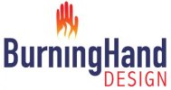
Sparky, you're right about DESIGNS being DESIGN, something I'd overlooked and then didn't pay attention to it (more concerned over the graphic image) I'm not really able to reduce the size of the text any more than I have now without major letter spacing and it looking wrong and think that the overall balance of the logo is good as is.

I've decided to use the negative space in the flame as a feature and not try to make the flame look more flame like with colour (experimented with little success) but just to add the fire-like glow to the hand.

Thanks

 

Attachments

  • bw+colour-final-bh-logos.jpg
    bw+colour-final-bh-logos.jpg
    9.7 KB · Views: 7
Back
Top