New Logo Design

tezdread

Member
Hey all,

First post here, I'm in the process of designing a site for myself and have designed a few sites in the past for others and also worked for a couple of (Print & Design) companies so have some 'real world' knowledge of the industry but it's been a while since I was actually working in this area so I feel a bit rusty...

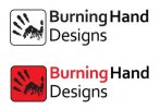
I like the font (Corbel) but want to change it but will keep it similar, something a little more technical \ geometrical that is as clear to read as this

I like it but what do you think?

Thanks
 

Attachments

  • bhd.jpg
    bhd.jpg
    16.8 KB · Views: 41
The font's fine, but not sure about the logo. Can you make a hand just out of flames?
The box doesn't lie up with the type. I'd vertically centre it. And it's a little bit close to it.

Don't personally like the keyline around the box either - it's a bit fussy.

As always, simplify.
 
Thanks for the reply's

Working on a new one, removing the hand from the box and adding flames to the whole hand in various areas, it will look like it is mostly flames but with a little bit of structure from the hand

Thanks
 
Something else to consider is does the logo retains its strength and clarity at a small size (50mm x 50mm for instance)?

I always refer back to is this quote:
"Always design a thing by considering it in its next larger context - a chair in a room, a room in a house, a house in an environment, an environment in a city plan."
Eliel Saarinen

Good quote to remember...

I always try to make sure a logo works in black & white and when scaled small-large. I think working with flames for a logo is quite a task because of these restrictions.

Flames are very organic and without colour to distinguish them, they may always be seen as something else (hair, water etc)

The graphic image won't be on it's own though so there will always be the indicator 'Burning' Hand, and almost never in black & white, even if it's photocopied or faxed it will still retain some greyscale appearance

I've not had the time to work on it yet but I think taking it out of the box and adding flames coming off the fingers \ hand (as well being on the palm) will work better and be less complicated.

Thanks
 
One last thing to consider is the typography - try to do something to the type that makes it unique and a part of the overall brand.

Your initial idea just showed the type as it had been typed out (maybe try and kern the letters tighter together or delete the dot in the letter 'I'). Don't do something for the sake of it but by altering or modifying the type, it suddenly looks like a more unified logo instead of a icon of a hand with some text next to it.

Good luck
 
Try this: draw a black silhouette of flame, then whiteout the hand coming up from the bottom of it so that the had looks like the 'inner flame'.
 
Try this: draw a black silhouette of flame, then whiteout the hand coming up from the bottom of it so that the had looks like the 'inner flame'.

Hey Sparky :)

I did try working the hand into the flame but couldn't get it to work so well so changed the hand from a 'hand print' to a basic illustration which is a little easier to place inside and also less clutter

Getting there?
 

Attachments

  • Untitled-1.jpg
    Untitled-1.jpg
    62.7 KB · Views: 11
Yeah they're working better for me because they're simpler. Quite liking the top left one.

I agree, the top left looks the better one out of those. The single flame and hand look to much like drops of water but even on a more complex flame it looks to much like a warning/stop sign
 
Top left is certainly the pick of the bunch but I feel that you could achieve greater synergy between the two elements with a bit of work.
 
Also, is the general opinion that the illustration of the hand is going to be better for a logo than my actual hand?
 
Yep that's what I mean.

I tried my hand illustration in a few ideas early on but couldn't shift the image of the clinical hand dispensers at hospitals out of my head...

Trying a few designs based around the hand illustration now
 
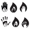
The latest designs...(low res, gif-4 c)

I don't think the second 2 work so well, but like the rest. 1 & 5 I think work the best though. What do you think?
 

Attachments

  • new-bh-designs-logos.jpg
    new-bh-designs-logos.jpg
    16.9 KB · Views: 6
I'd prefer version 1. However, I think the illustration of the hand needs to be refined (for instance, there seems an unnecessary curve on the thumb which no-one will see when the logo is reduced in size).

Have a look at the website logopond which will hopefully give you examples of strong but minimal logo marks.
 
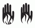
Ok, refined hand and have the flames with and without the smaller inner flame
 

Attachments

  • burning-handsx2.gif
    burning-handsx2.gif
    4.2 KB · Views: 5
Back
Top