Need feedback on my own logo brand

You all know and understand what the word means and the scope of the role. But the OP here is a graphic designer not a ‘designer’. Which means the logo should really have both words (or none).

And I totally agree about the tagline. Which is why I don’t think you need the second line in the logo as this will be covered in the tagline. Other wise you could end up with ‘Sapage Designs’ in the logo followed by ‘Graphic Designer’ in the tagline. Which looks a bit daft.
 
But the OP here is a graphic designer not a ‘designer’. Which means the logo should really have both words (or none).
Absurd really. Graphic Design in itself contains multiple disciplines, Graphic Art Managers, Creative Director, Art Director, Art Production/Artwork Specialist, Brand identity Developer, Broadcast Designers, Logo Designer, Marketing Designer, Illustrator, Visual Image Developer, Multimedia Developer, Content Developer, Visual Journalist, Layout artist/entry level layout/paste up/DTP artists, Interface Designer, Web Designer, Package Designer... etc.

For my logo you want me to have:
Hank Scorpio
Graphic Art Manager, Creative Director, Artwork Specialist, Brand Identity Developer, Logo Designer, Visual Image Developer, Layout Artist, Package Designer

for my tagline?

I can put Designer if I want.
I can put Creative Designer.
I can put Graphic Designer.
I can put Art Director.
I can put Layout Specialist.

None of any of those describe what I do aptly - I would prefer just 'Designer'.


But it's acceptable. And as soon as someone clicks into the webpage - takes a gander through the portfolio - and they can see hey this person does, Packaging, Logos, Websites - everything I need!

Or they will see that they only do Multimedia, Video, Web - and not what they need.
 
Personally, I would put something like Graphics or Studio maybe, if not Design.

After all, it's their company name - Sapage Graphic Designer wouldn't sit well for me.
 
You all know and understand what the word means and the scope of the role.
So would anyone looking for a person to 'design' something... our experience of people knowing the term, outside of design circles, is far higher than yours obviously.

But the OP here is a graphic designer not a ‘designer’. Which means the logo should really have both words (or none).
I don't technically have design in my 'business name' but I'm the same as hankscorpio in that I have multiple design terms that can describe me and my business. That ignores the 'art' side of my background (I've done art in my qualifications too) and actually what services I offer, they cross over multiple disciplines but all fall within the same 'business area', but what I do fundamentally do in my work is DESIGN things so that makes me a designer, or more accurately a multi-disciplined designer which is far harder to explain than just 'designer'

And I totally agree about the tagline. Which is why I don’t think you need the second line in the logo as this will be covered in the tagline.
You still don't understand what a tagline is, it's not really about describing the business services, it's like a catchy slogan... think about the coke one I said earlier, think about nike and just do it... neither mention what they are or what they do.

Other wise you could end up with ‘Sapage Designs’ in the logo followed by ‘Graphic Designer’ in the tagline. Which looks a bit daft.
But you wouldn't.....
 
What's in a name and a logo?

My opinion is a hell of a lot as it's often the first thing people see of you and people form opinions very quickly.

My slant is that a logo and branding for a Designer is even more important as this is one of the services we sell to our clients.
Ask people "What does a Graphic Designer do?" and almost everyone will say "They design logos, business cards and stuff".
That may have been kind of correct (in an ignorant way) many years ago but today a Graphic Designer's job can be extremely varied.
Just look at what companies ask for in job ad's FFS!

Like some of the other comments, I do many, many different things in my day to day.
Yesterday I was working on the branding and animation for a meditation app and also illustrating the title backgrounds for a TV show.
Branding, animation and illustration and just one day.
Am I a Designer, an Illustrator or an Animator?

I feel today, it's not about being technically correct, it's more about bending to people's perceptions of what we do because people are essentially lazy and stupid.
Think how people call a typeface a font or a vacuum cleaner a Hoover.
Neither are correct but they've become the accepted terminology.
Years ago when people used the Yellow Pages, people would choose a name that began with A because that came up first in the listings.
Crude marketing but it worked for many.

When I first started out on my own, I used my own name as I was doing mainly illustration and it's considered in the field illustration that using your own name is the way to go as you're selling a very personal service.
Now, I'm considering changing this to something more as an umbrella title as my output can look more like that of an agency and even my illustration style is very broad and as an illustrator people like to pigeon hole you to one style.
Having a diverse set of skills and marketing yourself as just one person can make you look like a Jack Of All Trades which can work against you for instance.
For me, most of my clients are other Designers are agencies so in a way, the way I present myself is especially important.

Personally, when I see other Designers business names and branding I immediately form an opinion and judge them.
As an example, when people use "productions or creations" I just see someone with no training, industry knowledge or experience trying to be a Designer.
When names get a bit stupid and random I just don't take them seriously at all and doubt their professionalism.
When I see "Graphic Designing" I instantly assume they're from India.
(No offence intended).
Just like everyone else, I form an opinion and stereotype very, very quickly and this is why it is so important to get right.

Our job involves a lot of smoke and mirrors.
We create an illusion of how people want to be seen so why shouldn't we do this for ourselves?
If I was a Bespoke Tailor I wouldn't call myself "Scotty's Fashions" and wear trackie bottoms and Crocks.

(BTW. Sorry to the OP for going slightly off topic)
 
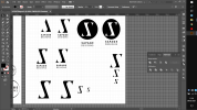
I manage to turn into a S with a subliminal masagged A i dont feel like ana is that much important sence there is thousands anas in portugal and other countries such comun trivial name but i include it as an extra, neither adds a S for sapage and also keep the style of the A.

But then again i have my doubts and i wondered if is realy readable.
I mean it kinda look like Z but reflected…
I thought then maybe add a circle could itencify the S curves but i am not sure it helped.

Captura de Ecrã (242).png
 
At the beginning it had the 'A' shape in it but as you changed it it just went into a stylised 'S' for me. That's fine if that's how you want it but it doesn't go with the intention imo.
 
Also, as an S is it pretty unbalanced. It looks like it is falling forward. The A solution works better to my mind – with a bit of fiddling.
 
Captura de Ecrã (243).png
.ok.

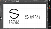
I have decided after another who knows how many tries i have done to go with this one and get it over with.
I tried work on others but idk at some point i didnt like the results.
https://www.graphicdesignforum.com/.../dda8a806d7ea166aaad83b8acdd6d143a0a42242.png

Its simple mordern sence is geometric, as this feminine side to it from the curved lines.
I want to go with something geometricly strict sence i am gona go in my portfolio and maybe my future work with infography wisch requires some geometrical alignments and percisions.
Making the combination of work mark and logo now is more amplafied to the versality of uses i can give it neither now or in future.
I also want to make it seem a bit futuristic tecnology related sence i have intention to make hologram in business card wisch relates to feminine cux of rainbow but also futuristic and related youth.

I tested the minimum thin printable.as well the minimum size of it.
I make sure the lines dont go under the 0.75.
Ik that minimum thin for print is 0.50 but from my notes of colege it say if i wanna somehow anyway put it above image i must make it 0.75 so also in case the printer is kinda crapy to and cant print lower 0.75 is perfect.
Lines are thin then again intencify feminism.
The S is in the same thin of sapage to relate to it better instead of word design.
 
That 'S' from a circle shape has been done to death, I've seen variations of that for longer than I can remember.

And honestly nothing of that design screams feminine to me, let alone 'intecify feminism'.... I'm also hoping that last bit is a language issue because feminism isn't something I'd be pushing in a logo....
Well in the psycology of shapes say so thin strokes and curved lines gives sence of feminism but only of course, youth and flowing which i find it appropriate
 
That 'S' from a circle shape has been done to death, I've seen variations of that for longer than I can remember.
There mind me alot similars but making someone totaly unique mind make it seem to risky and no body mind hire me for that.
 
Just use the words sapage design. Keep it simple. Once you start designing and getting contracts you can refine and update - just like all brands do.
 
I agree with the above. If typography isn't your forte, don't try and design your own logo (presuming you did that yourself).
 
Back
Top