Need feedback on my own logo brand

ana sapage

New Member
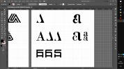
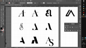
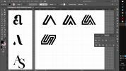
I been working on my logo brand and firstly i wanted to include a graphic of pie in my logo with a pencil icluding in it my 3 letters of the name A C S standing out for ana catarina sapage however i realise logo was to long and confusing so i try to simplify it as much as i could and yet be legible.
the most simplified versions are the down right coner.
i put proxima font sence is timeless and classic.
i also icluded difrent light to medium strokes of typography i think i mind go with the secound lighter version sence the first one if reduce the logo to small it gives trouble reading.

any sugestions?
give me feedback.
 

Attachments

  • IMG_20210129_161546.jpg
    IMG_20210129_161546.jpg
    128.9 KB · Views: 30
Proxima Nova was created in 2005 - how is it timeless and classic?
The heavier type is better.
The giant C thing looks like Pac Man.
I'd be in favour of the very last one for better reproduction across all mediums.
 
Proxima Nova was created in 2005 - how is it timeless and classic?
The heavier type is better.
The giant C thing looks like Pac Man.
I'd be in favour of the very last one for better reproduction across all mediums

Ah excuse me i mistake not proxima futura* i meant i confused.
i will make some changes experiments on last one and then show you.
 
It's a classic case of trying too hard to do something clever and it just doesn't work. It doesn't really look like a pencil and it
doesn't look like an A because it's on its side. I don't understand the pie at all. Remember - KISS - keep it simple, stupid!
Apart from the fact you don't need a brand - you're a designer, not a retail company.

It looks fine as just a name style with 'graphics' underneath, though the font is bit too 'techy' for me.
 
i try to simplify more of the one before i used futura again in both typography and A S.
Now that i amplify i notice that the stroke of S is kind thiner than A, and i wonder if thats not problematic is it?

is the typography size correct?
i reduced the logo and seems ok but is always better someone to give a perspective outside the box.

is it noticeable that A S make a pencil tip?
Captura de Ecrã (229)-1-1.png
 
Why do you think turning it on its side makes it look more like a pencil?!

Leave the A upright, find a font with a pointed A and fill in the lead with a tint of black. Then try and find a S that complements it,
good luck with that! ;)

ANA needs to be bigger (and lighter), not so spaced out.
 
Why do you think turning it on its side makes it look more like a pencil?!

Leave the A upright, find a font with a pointed A and fill in the lead with a tint of black. Then try and find a S that complements it,
good luck with that! ;)

ANA needs to be bigger (and lighter), not so spaced out.
Something like this?
Why not put the line of the A oblique to identify the pencil sence pencils dont have the line completely straight anyways.
 

Attachments

  • IMG_20210130_185501.jpg
    IMG_20210130_185501.jpg
    203.8 KB · Views: 4
But then it loses the pencil shape and also its uniqueness.
How should i do to keep the pencil shapes?
Perhaps just lose the whole pencil shape. At the risk of sounding harsh, it’s not particularly unique anyway. It has been done a thousand times in various guises. Over on the other forum, I see you posted a lot of sketches. Some of those were far better. I’d suggest pursuing this route. Good look and I look forward to seeing the results.
 
It is tempting to use the shape of the A to make a pencil.
But as pointed out it's been done forever and not unique.

Just use your name with a futuristic font.
 
Try a very expanded S.

Personally, I would forget about the pencil. After all, you're a graphic designer, not an illustrator.
 
How about:

ACS

That would work as a logo. Just need to choose a nice font and colour and you are good to go.

When someone lands on your website they might glance at your logo for a nanosecond but after that it becomes irrelevant. If you were settling branded goods then a logo might have some significance but for a graphic designed much less so. People will employ your services based on your portfolio not your logo.
The logo is the face of your business.
People say not to judge a book by it's cover - but you naturally do.
If they don't get past the logo - they will never look at the portfolio.
 
Remove the logo from your site and see what happens. I’d put money on it making no difference to your conversions.
 
Remove the logo from your site and see what happens. I’d put money on it making no difference to your conversions.
The issue here is not simply about, cold, hard numbers and conversions. A logo and brand identity – and the name itself – are important; as much for a designer as for someone selling luxury goods, for example. Possibly more so in this case. You would have very different brand identity if you wanted to attract clients from, say, the construction industry and related services, than you would if you targeted the financial sector. You need people to get as far as looking at the portfolio and you have made several assumptions before you even get there.

It is all about the emotional response you wish to elicit from the target audience, as it is cold, hard, pragmatic visitor clicks. Otherwise, everything, everywhere could just be set in Helvetica or, perish the thought, comic sans!.
 
I totally agree. But this is a logo for a graphic designer. They aren’t selling luxury goods. They are just marketing a service.

I’ve done a lot of testing in this over the years and in most cases for a service provider just putting the name of the business at the top of the page is all you need. I agree the font and colour are important but not the logo. Do some testing yourself and see what happens.

Without scrolling up, can you accurately describe the logo on this forum? You may remember what it says but not the details.
 
Without scrolling up, can you accurately describe the logo on this forum? You may remember what it says but not the details.
I can... in uppercase two shades of grey for graphic (darker) design (lighter) and then a mid blue coloured squared 'speech bubble' (going towards the left) with forum in white coming out of the 'v' in the N.... underneath is .co.uk (lowercase) in the same blue as the speech bubble.

I can do the same for many other companies too and I'm not even focused on branding in my area of design.

Branding, which is not just the logo, IS important, at the very least for differentiation from competitors, and in the case of a lot of businesses the logo is as recognisable, if not more so, than the actual name of the company....

Just look at more well known brands like apple, they primarily use their logo, MS are shifting away from using the text microsoft in their identity to the 4 square 'window', most car companies put an emphasis on their logo on the front of the car, clothes brands such as supreme (and others like it) are purely about the 'brand name' and their entire logo is type based....

If a logo (and this can be type or image based) wasn't seen as being important major well known companies wouldn't spend millions on maintaining their brands and suing companies that have similar designs etc.

Oh and you do know you're actually contradicting yourself.
I agree the font and colour are important but not the logo.
A logo can be type based and in a lot of cases a typographic logo is essentially a custom font and a colour....

So unless all your sites where just black default html text on white pages with no changes to the font every site that was 'just the name of the business at the top of the page' was actually being given a typographic logo and as such being branded....
 
To the OP...

Move away from the 'pencil' idea, it's been done to death.
 
I manage to get away from that pencil idea and simplify main letter A and S.
I also fixed some letters that looked way odd.
And try simplify that same stroke AS and put the S verticaly that was layed and put the A bellow but some cutves to identify better the AS.

How is it now?
 

Attachments

  • Captura de Ecrã (233).png
    Captura de Ecrã (233).png
    88.5 KB · Views: 5
  • Captura de Ecrã (230).png
    Captura de Ecrã (230).png
    73.9 KB · Views: 5
  • 7dd1201eca6f6eda653ed04de1f1061690ab21f6.png
    7dd1201eca6f6eda653ed04de1f1061690ab21f6.png
    72.7 KB · Views: 5
Back
Top