Hello everyone, I made a logo for a start-up company in Germany who offers a service to build telephone masts for big network providers. It’s a B2B company. I’m now in the final stage and would like you as designers to judge the logo in regards trecking, kerning, spacing, font selection and the gradient colour. I’d appreciate your critic.
You are using an out of date browser. It may not display this or other websites correctly.
You should upgrade or use an alternative browser.
You should upgrade or use an alternative browser.
Logo design feedback
- Thread starter Bean
- Start date


General feedback is that it's not very good.
And if you don't know these things then there's very little we can do to assist.
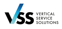
The font is awful boring and not very creative.
Gradient colours are going to be a nightmare to produce consistently across various substrates and print processes - including non-print services like embroidery.
You say you're into the final stages - which screams to me that you're doing this on website dedicated to competition logo design.
Which is strictly not allowed on this forum.
I wish I had better news for you. But it's a thumbs-down from me.
It's called Tracking.judge the logo in regards trecking, kerning, spacing, font selection and the gradient colour.
And if you don't know these things then there's very little we can do to assist.
The font is awful boring and not very creative.
Gradient colours are going to be a nightmare to produce consistently across various substrates and print processes - including non-print services like embroidery.
You say you're into the final stages - which screams to me that you're doing this on website dedicated to competition logo design.
Which is strictly not allowed on this forum.
I wish I had better news for you. But it's a thumbs-down from me.
hey
hey, thanks for your opinion. Not really constructive but thanks for a replay. There is no competition. Don't know why you are so negative? I would like to get a constructive critic from designers because I'm working always alone and would appreciate a creative exchange. Thank you
General feedback is that it's not very good.
It's called Tracking.
And if you don't know these things then there's very little we can do to assist.
The font is awful boring and not very creative.
Gradient colours are going to be a nightmare to produce consistently across various substrates and print processes - including non-print services like embroidery.
You say you're into the final stages - which screams to me that you're doing this on website dedicated to competition logo design.
Which is strictly not allowed on this forum.
I wish I had better news for you. But it's a thumbs-down from me.
hey, thanks for your opinion. Not really constructive but thanks for a replay. There is no competition. Don't know why you are so negative? I would like to get a constructive critic from designers because I'm working always alone and would appreciate a creative exchange. Thank you
Because there is nothing positive to say.Don't know why you are so negative?
Sorry
I have you constructive criticism.I would like to get a constructive criti
Wardy
Well-Known Member
It is a little bit boring, which is why there's not a lot to critique really.
Why a tick, if that's what it is? A tick needs to have meaning and in this case it makes the logo slightly less legible and it certainly doesn't say 'telephone masts'. And it's not vertical!
Why is it not in German?
Why a tick, if that's what it is? A tick needs to have meaning and in this case it makes the logo slightly less legible and it certainly doesn't say 'telephone masts'. And it's not vertical!
Why is it not in German?
Hey guys,
I've changed the font and worked on the tracking. I had quite a few errors in there. But I guess no one will comment on that so no point to upload it. The tick stays for finding a solution. Problem solved - you tick 'that box'. We wanted to keep the logo as simple as possible and yet it has to stand out from its competitors which it does. I don't like the fact that the word mark is in English either. But I haven't decided that.
Thanks guys.
I've changed the font and worked on the tracking. I had quite a few errors in there. But I guess no one will comment on that so no point to upload it. The tick stays for finding a solution. Problem solved - you tick 'that box'. We wanted to keep the logo as simple as possible and yet it has to stand out from its competitors which it does. I don't like the fact that the word mark is in English either. But I haven't decided that.
That's correct.And it's not vertical!
Thanks guys.
I'd be interested in seeing the update.
There are things to consider like the gradient being difficult if not impossible in all situations.
I can't get over the fact I don't like the logo. But it's just my humble opinion. And it's a stark reality when presenting options to clients that they just turn and say they hate it.
Which has happened to me. And I filed it away and reused it later on and the client loved it.
Every now and then you won't get critic like you want. And if you are just looking for a thumbs up then I can't help with that.
What I can tell you from twenty five years in prepress, design and print, and be creative director, that this logo so far didn't wow me. And I was hit with a feeling of dread for production.
For instance, the stationery will be printed on 120gsm uncoated for compliment slips. And 350gsm silk for business cards.
Two different stocks will produce different colours. And a careless printer or a print broker that outsources will end up with different variations of color.
Let alone banding issues.
Embroidery, large format, digital, litho, flexo, screen printing, and many other ways the logo will be used will make it difficult to work with.
I'm not saying that gradients can't be used in logos. Very famous brands have gradient logos.
But those use gradients to accent good logo design. You've used a gradient to hide the weakness in your design. The gradient shouldn't be the focal point. It should be for a bit oomph to enhance the design. Not the design focal.
Another thing... and it's necessarily a bad thing. A lot of logos have this issue - but they are generally well known.
NIke, Adidas, Humm, Google, Yahoo etc.
They don't actually say what they are and what they do.
But as it's a startup Vertical Service Solutions doesn't actually mean anything to me - or what they do.
As they are probably bidding for work and the logo will probably be used in their work this way it will be obvious what it is.
But I'm just wondering if you'd be better stacking the VSS.
V
S
S
It might look like a telecom mast then.
You could even wireframe the lettering to give the appearance of a mast.
But nothing complicated, basic outlining of the text with a thick enough stroke and some connector points.

Just an idea.
NIke, Adidas, Humm, Google, Yahoo etc.
They don't actually say what they are and what they do.
But as it's a startup Vertical Service Solutions doesn't actually mean anything to me - or what they do.
As they are probably bidding for work and the logo will probably be used in their work this way it will be obvious what it is.
But I'm just wondering if you'd be better stacking the VSS.
V
S
S
It might look like a telecom mast then.
You could even wireframe the lettering to give the appearance of a mast.
But nothing complicated, basic outlining of the text with a thick enough stroke and some connector points.
Just an idea.