pcbranding
Member
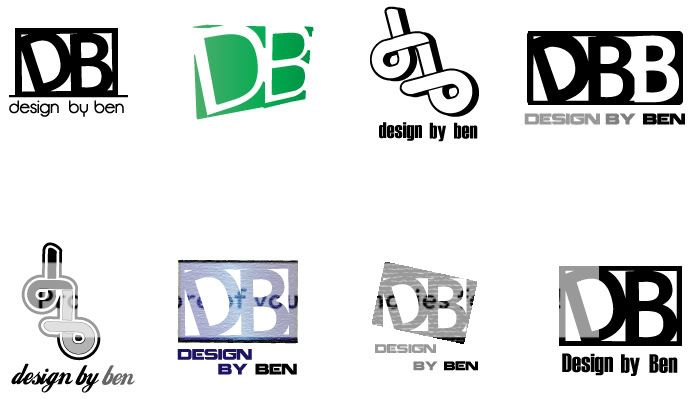
Hello. I think bottom left of the last selection has the most potential. Now it's down to selecting a good typeface or working out how you can you use the counters from the letters or the negative space around them left by the square to create the 'D' and 'B'.
It's also just one colour which is the best way to design logos. Adding effects to a logo doesn't help if the basics of the logo don't work.
Paul
It's also just one colour which is the best way to design logos. Adding effects to a logo doesn't help if the basics of the logo don't work.
Paul

")