You are using an out of date browser. It may not display this or other websites correctly.
You should upgrade or use an alternative browser.
You should upgrade or use an alternative browser.
Logo critique- THINK WINGS
- Thread starter possibilityfourteen
- Start date
possibilityfourteen
New Member
Thanks for the honest answers! Appreciate it! Wings are part of previous logo that I was asked to keep. Maybe an emotional attachment? Other directors love it. However I can see where your coming from. So I will try again and try and persuade! Think major issue is that company has changed name and elements don't work anymore! Would love to ditch wings completly.
possibilityfourteen
New Member
It does come to think of it!
possibilityfourteen
New Member
Freedom to th!nk
possibilityfourteen
New Member
Levi
Ultimate Member
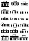
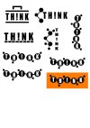
You're restricting your ideas with the ! in think. There's no reason you couldn't come up with a nice logo which works with a clean simple text 'think'.Just working through some rough ideas. Trying to get them all out of my head. Based on TH!NK tools and connections.
View attachment 7193View attachment 7194
possibilityfourteen
New Member
Shares THINK tools with the community to help them achieve their goals!That makes no sense at all. Everyone has the freedom to think. Restrictions happen when you try express those thoughts.
What does this company do?


