

Rwilliams21
New Member
Hello
I have been designing a logo for a small company that washes football teams kits and sends the back to them week by week. It is hopefully going to be used for print and web purposes but the feedback i have received from the owner has been pretty much next to nothing, all the feedback i got was
'oooo i like it!'
So i have signed up here to try get some feedback from people who know what they are doing.
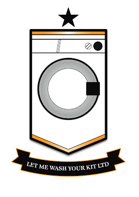
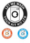
The logo i have made is below and the one the owner sent me that was done by another person is under it.
I am trying to incorporate a badge/crest theme and personally think the text of the company is too small and maybe too detailed for use a letter head or business card logo.
Thank you for looking and would very much appreciate any criticism and feedback

I have been designing a logo for a small company that washes football teams kits and sends the back to them week by week. It is hopefully going to be used for print and web purposes but the feedback i have received from the owner has been pretty much next to nothing, all the feedback i got was
'oooo i like it!'
So i have signed up here to try get some feedback from people who know what they are doing.
The logo i have made is below and the one the owner sent me that was done by another person is under it.
I am trying to incorporate a badge/crest theme and personally think the text of the company is too small and maybe too detailed for use a letter head or business card logo.
Thank you for looking and would very much appreciate any criticism and feedback
")