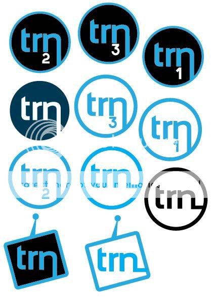
Logo crit please

theking79

Member
Hi, I am looking for some advice on these logo designs, they are for my final major project at college, I am rebranding a fictional TV/Radio company called TRN. The company will be aimed at people around the age of 20-50.
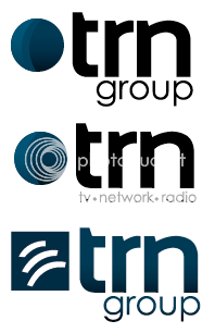
Picture3.png


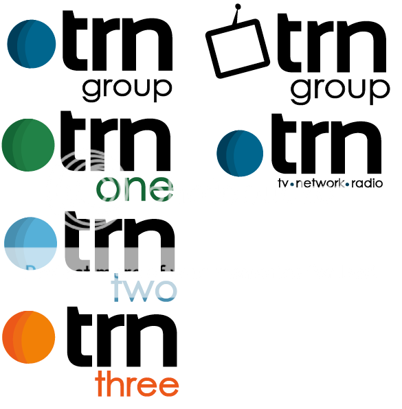
Picture2.png


I like the look of these logo's, but they don't look like a TV station logo to me.
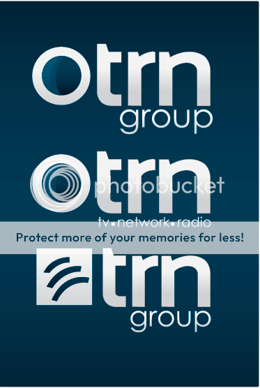
Picture1.png
 
just a quick reply here and of course you would want to possibly give more info on perceived quality/product/service.

I would ditch the rss icon type parts, it's too much like an rss icon which is pretty standard nowadays.
I think it's important to show within the logo what they're about so tv-network-radio should be a part of it, however, if your wanting to split them amongst various groups such as 1,2,3 etc.. then something universal
The telly icon is a good idea, simple, does not need anything more but has been done lots? (would have to research that market)

Have you looked at other radio, tv networks?

I would say your research, insight and methods would account for more of your project marks than the actual logo you end up with, so you should also think of promoting that aspect too (in case your spending more time on the logo?)
 
there was a really good article in computer arts a while back that featured the re-branding for Heart FM.
You might find it useful to take a look at it.

I don't have a direct link to the article but if you google "heart fm re-branding" it should be the 3rd result on the page that appears as a link to a pdf. Well worth a read.

cheers
dave
 
I agree with Kev on the RSS style icon, it's a little too 'webby' and plays on quite a well known icon.

Just a quickie that I think your lecturers may pick up on: The company's called 'TV Radio Network" but the tagline underneath a couple of the logos reads Tv Network Radio (which also doesn't make sense).

The round logotype is similar to the branding for the recently launched Watch channel (an eyeball looking off to the left). I do like the little TV logotype though, it's nice and simple.
 
these are interesting. The circular ones remind me of the ten network logo from Australia. I think the last one on the bottom right is really starting to look like more of an identity and could be developed into something really dynamic. Remember to think beyond just the logo and how it could be developed into a brand and possibly a marketing campaign.

Another good example that was in computer arts was the BBC Three re-brand that was done a while ago.

Haven't had chance to have a proper look for a link to that particular article but here's a similar one from Creative Review that may be interesting for you....

http://www.creativereview.co.uk/crblog/bbc-three-–-rebranded/

It's always a good idea to rationale your ideas based on your research as part of the project...so you could refer to these articles in your documentation.

yes i have an idea for the advertising campaign i thought of a while back, i thought having the slogan 'trn it on' as a part of the advertising campaign, i would have it lit up glowing in the dark or something with someone holding a switch with a wire attached to it, can be done in photoshop/illustrator, just need a photo.
 
The bottom symbols are working well… (Blue TV)

You have illustrated some nice work here so far and I would consider taking the symbol further. Seeing as you have the TV shape you could put media in it e.g. The fictional company could have a sporting network and you add images (photos) of sports in that instance of the symbol. Same for shopping, news etc… You can always retain the simpler, one-colour symbol for when you need that version. It may not work as that central area will get a bit busy but it may…

I would also consider breaking the line near the join with the 'n'. This could make the symbol just that more iconic and imply the network part of the business (the continual line joining the elements).

Just my t'pence for you. Nice work though.
 
Back
Top