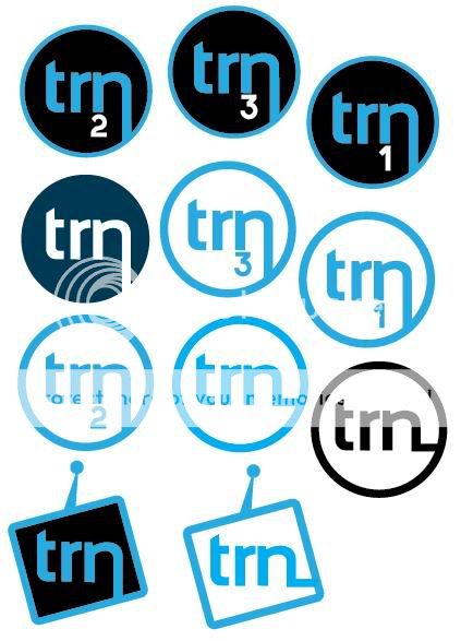
Hi, I am looking for some advice on these logo designs, they are for my final major project at college, I am rebranding a fictional TV/Radio company called TRN. The company will be aimed at people around the age of 20-50.
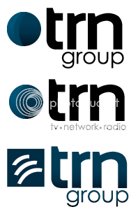
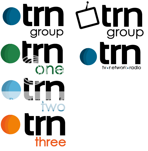
I like the look of these logo's, but they don't look like a TV station logo to me.

I like the look of these logo's, but they don't look like a TV station logo to me.