Investment company logo critique please

nikoloz

Member
Hey everybody,

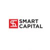
I need just a quick critique about this logo I'm working on at the moment.
Basically it is a "capital group" like an investment company, its a 1 man company, who's got a several million money and invest in new or old business with his partners.
At the moment they don't have much branding or anything, they just know that they need a logo, as it happens most of the time....
and the name "Smart Capital"

Now, i thought I don't want to show some kind of a symbol like charts or other investment cliche symbols, instead I though just to make typography based strict logotype.
I have few samples, but at the moment I like this one most, so i wanted to hear some thoughts... what you think?
I see it in future ads in some kind of a way and think I could develop as a whole identity but....


Thanks
 

Attachments

  • SC_sample_01.jpg
    SC_sample_01.jpg
    66.7 KB · Views: 80
Paul Murray

Do you feel now that bold is little bit better? hmm don't know

what about this second version of mine?
SC_sample_01_1.jpg
SC_sample_02.jpg
 
Nikoloz, in the last sample (white background) the lines that are forming the S and C are too weak. You could have problems in small printing, like ballpens, pencils, lighters and the like. Always keep in mind design for brands from small to big. If it works in small printings, should work in big ones, but not contrary. I would suggest to try with wider lines.

The color is ok for the purpose.

The C, in my opinion is a bit lost. S is easily recognized, but C not so easy. Keep in mind people lacks your designer vision / knowledge.

Nice work overall.
 
I don't think it needs the initials at the start as a logo element - basically because I think it's an overused technique that I'm finding tiresome.

I'd drop that and put something a bit more relevant if you need a logo element.
 
I just don't think it needs the initials to be the logo element.

The words Smart Capital on it's own is fine. You don't really need a "SC" at the start of it.

It's an investment company. Would you not consider a different logo type that illustrates what the company does rather than using "SC".
 
its really hard to find the right symbol for this kind of a serious company, it dose nothing, its got money to invest thats it,
now, I think using thing like charts, pies and dolar signs is too much for this kind of a thing, is not it?
If you mean abstract representation of what it dose? than it could just be the square dot or any shape merged with typography? u mean?

03logo.jpg
 
Honestly, that looks like a "high school" logo, and not a serious investment company.

I totally agree that charts, pies and dollar signs would be inappropriate.


Have you researched similar companies and their logos?
 

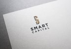
I still really like this, but I get what hank's saying; It's a nice identity but it's perhaps not right for the company. One thing I'm not keen on though is the letter-spacing of CAPITAL to make it align to SMART. It looks too wide to me.

Definitely look at what the client's competitors and similar companies are using and try and do something different. A quick Google image search for "investment company" through up lots of naff, dated, generic designs, so you're already on this right path with this. The orange is interesting, could this be more "golden" (or even a gold-foil) to relate to wealth? And this is a bit of an abstract thought, but the A in SMART makes me think of a mountain peak, or if you were to extend the legs of the A down, you could perhaps explore the concept of an iceberg (though I'm not sure a company that invests in others, would like the connotations of "sinking" that an ice berg brings). Basically the thinking is along the lines of "big", "expansive", "towering", like the owner's pile of money perhaps?

Or, as hank suggested, perhaps it doesn't need a logomark at all, and a custom logotype is the answer, though I know it can be hard to sell a "just text" logo to a client at times. For something, I guess you could say, luxurious like this though, I definitely think "less is more". A strong logotype in a strong blue (like what I think I can see in the SC part of the logo) debossed onto some super thick business cards could just be the basis of the branding.
 
I wouldn't necesarrily say I am leaning towards a logomark or not, I just wonder if it needs it - and if it does I don't think I'd use the initials of the company, as I feel it's quite outdated.

Where utilising the letters, like the A to a mountain top, or even an arrow tip to the top of the S could indicate direction and incline - maybe both ideas are too cliché?


Investment to me would be growth and wealth.

A bit of reasearch on "colour emotion" would give some ideas.

And research into imagery for growth and wealth is also needed.
 
It's not my style - or my likings.

This should come back to the brief you were given, and research you have done on the company and it's competitors.

On that current logo - you're still using the initials of the company...?
 
I'm using initials because thats was their previous logo was which they wanted to rebrand, They have asked for simple typographical logo mark, in fact they wanted it very quick and they have only paid for the hours which I need to develop those concepts showed above, this could be another matter of discussion but do you think designer should overdue the work he was given for the price? if not won from the beginning any other radical ideas? and everything has been agreed on so? do we still have to work more hours to show what we really want them to be, spent more time versus money, just because too make something better?
or should we stop at some point, and say its more than enough for what they are paying for now?
they dont do further discussions, they say they don't have competitors, they say they need something uncreative.

of course I have researched similar companies world wide, and at the end it get too your bottom line and your instincts and intuitions, maybe thats what I feel will go through now which wont be kick-ass but not rubbish as well.
 
Back
Top