Stu Wilkie
New Member
Hi guys,
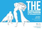
Just looking for a critique on an A5 flyer I am working on for a Personal Fitness studio near where I live (promotion regarding a new fitness program). It's quite adventurous, but I think it reflects the studio's 'cool' image fairly well. I'm going to dice up the paragraph of text on the rear page and change it to something more apt for the theme (so almost ignore it).
Probably about half to 3 quarters done but looking for some feedback just to check I'm not going insane.
Cheers,
Stu.
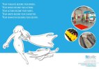
P.s Not sure I like those photographs on the back page, I think they kind of f*ck up the overall colour scheme.
Just looking for a critique on an A5 flyer I am working on for a Personal Fitness studio near where I live (promotion regarding a new fitness program). It's quite adventurous, but I think it reflects the studio's 'cool' image fairly well. I'm going to dice up the paragraph of text on the rear page and change it to something more apt for the theme (so almost ignore it).
Probably about half to 3 quarters done but looking for some feedback just to check I'm not going insane.
Cheers,
Stu.
P.s Not sure I like those photographs on the back page, I think they kind of f*ck up the overall colour scheme.