You are using an out of date browser. It may not display this or other websites correctly.
You should upgrade or use an alternative browser.
You should upgrade or use an alternative browser.
First Timer, multiple designs
- Thread starter Daniel T Jones
- Start date
You have to think about the bigger picture - and by that is - can this be printed on all mediums. Business card (small logo size), can it be printed on a t-shirt, can it be embroidered, can it be printed on vinyl for a window display, can it be one colour and still recognisible. What would happen the logo if someone, I don't know lets say faxed it, or did a poor scanning job of your invoice...
What you have here is an arrow with a chimney. And ask yourself, is this what you want your company logo to really be? I don't think there's enough thought gone into the typography and there's no link to the logo. Your strapline is "Key Properties" but not a single reference to a key in your logo.
A lot of your logo options are not options, they are different fill settings for the arrow. You really need to step away from the computer and it's funky fill settings, and get cracking with pencil and paper. Work only in black and white to begin with (not gray) and make a simple logo that reflects you, your company and isn't just an arrow pointing nowhere with a chimney lumped on the side of it.
Daniel T Jones
New Member
Great points thanks. 
I chose key properties on the thought process of using "key" as in, the main aspect. i.e the key to happiness, the key to success. The vital piece of information/object (superior) if you will.
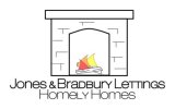
I have just listed items that represent "home" and came up with a few. I have done a mock of something simple. I did it before your suggestions but it seems a little simpler and more relevant.
I do agree about the arrow. I was having a mind blank, but also itchy fingers, so i thought ill work with that until something inspired comes along!

It's still extremely weak - it looks like a graphic from a 1980s computer game. Plus it could be conveyed as just selling fireplaces - if the logo ever went without the text, it could be confusing.
Conceptwise - it's very strong.
I think you'll get much better results by drawing it and making it less "computer like".
The idea of the fireplace is to make it warmly - and having it computer drawn seems cold.
Conceptwise - it's very strong.
I think you'll get much better results by drawing it and making it less "computer like".
The idea of the fireplace is to make it warmly - and having it computer drawn seems cold.
And by drawing I mean hand draw on paper first.
Daniel T Jones
New Member
So...
I need to keep with the idea of home related things. but make them more "real" rather than boxy and square?
I need to keep with the idea of home related things. but make them more "real" rather than boxy and square?
Perxactly!
Honestly, it's very difficult to get something good working just on the computer.
Get inspired by houses and draw and draw and draw them, draw elements about the house, stanchions, extensions, what makes a home a home.
Most importantly, make it make sense.
Honestly, it's very difficult to get something good working just on the computer.
Get inspired by houses and draw and draw and draw them, draw elements about the house, stanchions, extensions, what makes a home a home.
Most importantly, make it make sense.
Paul Murray
Ultimate Member
Hank has provided some useful feedback, but I strongly recommend you consider hiring a decent professional designer and get some adaptable branding designed that is unique to you and your business..
Whilst it may seem like you're saving money by doing it yourself, a poor, cheap-looking logo will not provide a very good first impression of your business, which could actually result in a loss of custom when people dismiss your company at face value.
Some well-designed branding will be a good investment, as it will last you years.
Daniel T Jones
New Member
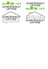
Ok, SO. I thought more about what things represent.
I used icons on the first to represent what "home" makes me think about.
The second is trying to represent everybody being welcome under one roof.
Thanks everyone. I have thought about how it'll look on other mediums and in black and white. I know they're not perfect but don't want to advance if it's missing something critical.

Last edited:
zoey
New Member
I would have to agree and say you should hire a professional designer, it's so important to get branding right.
You seem to have a good idea of your concept, if you have time on your side keep designing and your logo will get better. But it does need a lot of work.
Best of luck on your new business venture!
You seem to have a good idea of your concept, if you have time on your side keep designing and your logo will get better. But it does need a lot of work.
Best of luck on your new business venture!
