You are using an out of date browser. It may not display this or other websites correctly.
You should upgrade or use an alternative browser.
You should upgrade or use an alternative browser.
First Critique Post!
- Thread starter Squevasquidge
- Start date
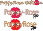
I'd say the one at the top is the most accomplished (and has the advantage of meeting the brief font-wise). I think it could potentially be improved by re-positioning the flower/thread thing but I'd be happy presenting it to your client for comment as-is (I'd perhaps remove/rethink the thread loop at the end though as it adds unnecessary length and could be mis-read as a random 'e')
Squevasquidge
Member
Thanks people!
Sent it to client and she is happiest with the top one, I've tweaked it and am giving her an option with a smaller button in place of the first o as well. Have just emailed it so should hear soon.
If anyone is still out there whats the best formats to send it in?
Thanks,
Eva
Sent it to client and she is happiest with the top one, I've tweaked it and am giving her an option with a smaller button in place of the first o as well. Have just emailed it so should hear soon.
If anyone is still out there whats the best formats to send it in?
Thanks,
Eva
spottypenguin
Active Member
Depends, if you mean so she can't "nick" your design as is without paying then probably a low res jpeg with a watermark through it. If you mean as an end product (that she may use for print and web) then you should probably supply an eps, jpeg, png and likely a print quality pdf. But most clients will say "can I have it in...."
Squevasquidge
Member
Yeah I mean as an end product (Im not getting paid as she is a friend or a friend and I wanted to practice on her!!). I dont think she wll know what she wants it in. Im not overly clued up on different file formats...at all really. I have to transfer it into photoshop to turn it into a jpeg? I couldnt seem to do it from illy. Do I have to do anything wierd or wonderful to change them properly?
Once agan, thanks, I've learned so much already! And sorry for my stupidity but we all start somewhere!
Cheers!
Eva x
Once agan, thanks, I've learned so much already! And sorry for my stupidity but we all start somewhere!
Cheers!
Eva x
spottypenguin
Active Member
No, in Illy you choose Save For web & Devices then you can select jpeg etc.
Squevasquidge
Member
Help again
Really struggling with font to go with lucida handwritting. Any advice, not that you haven't given me loads already lol!
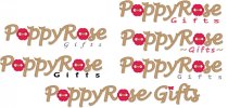
I dont think the version with gifts in the same style works too well. I think its unbalanced looking. So Im trying to find a font to write gifts in but its not happening. I dont even know if the placing of it is right either!
Eva xx
Really struggling with font to go with lucida handwritting. Any advice, not that you haven't given me loads already lol!

I dont think the version with gifts in the same style works too well. I think its unbalanced looking. So Im trying to find a font to write gifts in but its not happening. I dont even know if the placing of it is right either!
Eva xx
Tony Hardy
Well-Known Member
I'd say the placement of the text is in the right place, it's just the scale/font to get right. I'll have a think on some fonts for you.
Paul Murray
Ultimate Member
Second one down on the right works for me with a few changes.
Make the 'Gifts' text solid, not an outline.
Make the curves either side a solid line since you won't get the detail when it's small.
In general, try not to adjust the tracking (the spacing of the letters) too much because it will lead to ugliness and legibility issues.
Make the 'Gifts' text solid, not an outline.
Make the curves either side a solid line since you won't get the detail when it's small.
In general, try not to adjust the tracking (the spacing of the letters) too much because it will lead to ugliness and legibility issues.
Tony Hardy
Well-Known Member
I like the opposite one to the left to what Paul was saying too. I'd try it and red and yeah, sort the tracking out.
Squevasquidge
Member
A bit of time later
Hi Guys.
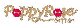
I had another look at that logo and now have ended up with this..
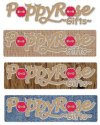
Im really happy with it. I'd love to know if you think its been improved or messed to much? Im going to send it to client as it perfectly fits the brief. Technically it probably lacks a bit. But Im sick looking at it and want to get it away. The image could be really bad quality as its a screen snap!
Thanks in advance!
Eva x
Hi Guys.
I had another look at that logo and now have ended up with this..

Im really happy with it. I'd love to know if you think its been improved or messed to much? Im going to send it to client as it perfectly fits the brief. Technically it probably lacks a bit. But Im sick looking at it and want to get it away. The image could be really bad quality as its a screen snap!
Thanks in advance!
Eva x
Squevasquidge
Member
Yup...I'll upload a high res!
Squevasquidge
Member
Squevasquidge
Member
Kev Clarke
Member
I like the 2nd image, but one thing i feel looks out of place is the capital letter at the beginning of each word in the sentence below?
Dumb_pencil
Member
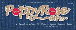
I like the 1st image, however think you need to tweak the dotted line around the name... maybe try a thinner dotted line or changing the colour of dotted line or some how softening it? Apart from that it looks good.
I don't think it will be too popular with the others on this forum but I would be tempted to but a shadow under the name so it gave it a bit more of a raised image/look.
I don't think it will be too popular with the others on this forum but I would be tempted to but a shadow under the name so it gave it a bit more of a raised image/look.
Katedesign
Well-Known Member
The wording underneath the logo needs kerning... "So mething" and "So meone" - as someone say it's not usual (in the UK - it's an American thing) to use caps on the beginning of each word.
I like the whole logo though.
I like the whole logo though.
Kev Clarke
Member
I'm with Dave it might even disappear the smaller the logo goes, it is hardly visible on the attachements above before zooming in?
