You are using an out of date browser. It may not display this or other websites correctly.
You should upgrade or use an alternative browser.
You should upgrade or use an alternative browser.
Farm Shop Logo Design feed Back
- Thread starter gsmedia
- Start date


Ian Bonner
Member
I'd agree with the comments above. One other thing is how legible it is when it is reduced in size. The namestyle might be ok but I'm wondering if the rest of the logo just merges together at a smaller size.
")
Hi,
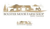
I am currently working on a logo design for a Farm Shop. Any feedback would be great thanks.....
Hey gsmedia,
Looks good, maybe less is better though?
For me all you need is the tractor on the right (with the fixed front wheel) and cow on the left (maybe a smaller cow next to it) You don't need the trees clouds and birds to show that this is a farm and as others have said it could merge together on smaller sizes.
SparkCreative
Member
It's waaaaay too complicated. Simplify.
It's waaaaay too complicated. Simplify.
I'd agree with this if we were in a different context but for a farm shop I think the folksy homemade feel is spot on and the higher-level design value is in the well-balanced execution.
SparkCreative
Member
I'd agree with this if we were in a different context but for a farm shop I think the folksy homemade feel is spot on and the higher-level design value is in the well-balanced execution.
It's not to do with the 'folksy' feel, it's to do with the fact that it doesn't work as a logo - it has too many elements and when it's reduced down it's too complicated and doesn't read well. i like the concept, but I think the illo could be simplified, still keeping the feel of the thing but making it work harder and better.
Ian Bonner
Member
I'd agree with this if we were in a different context but for a farm shop I think the folksy homemade feel is spot on and the higher-level design value is in the well-balanced execution.
Yeah but I think what we are saying is just to use less of it. The concept to me is fine, but it's overcrowded.
I'd argue that it has a certain simplicity; not in terms of being reduced to a small number of elements or anything like that, obviously, but in terms of the simple, naive approach (I'm referring here to naive in the context of naive art rather than the more common definition). I'm not trying to make the case for this being the right or wrong way to go but I believe that it's a valid and appropriate one in the sense that it broadly meets my expectations for something like a farm shop. There is, of course, the valid objection that it may not be fit for the intended range of applications but if these involve it being reproduced at a size no smaller than the small example provided, I think it's fine.