Hi,
I have a project I am creating for a financial industry business compliance startup. The design has to appeal to a conservative, detail oriented audience. They want to convey they are competent and that they make the process enjoyable, but specifically without "fun!" jumping out at the viewer/personality being emphasized as a major component. They also are fitness enthusiasts and have incorporated that into their approach to business.
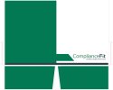
I drew up a logo and did a draft of a pocket folder design. I tried to pull the logo imagery over to the folder as a motif while also trying to do something that tries to communicate precision.
Can I please get feedback on both? Thank you in advance.

