You are using an out of date browser. It may not display this or other websites correctly.
You should upgrade or use an alternative browser.
You should upgrade or use an alternative browser.
Stuck
- Thread starter Yohn
- Start date
Are you saying I should leave it as a logotype and get rid of the squigglesNeither.
What are those squiggles (they don’t look like your initials)? Why do you think you even need them?
fisicx
Active Member
Yes.Are you saying I should leave it as a logotype and get rid of the squiggles
Or just style the name using CSS and let the website sell your services. Very few people take notice of a logo unless it's a famous brand. without scrolling up to look can you even remember the logo for this forum?
Very few people take notice of a logo unless it's a famous brand.
I disagree with that to be honest, if I'm looking for a service or product and the company has a shit looking logo designed in word I wouldn't use them, it just doesn't instil confidence.
I agree the site has to sell the services etc but you need to get customers to the site. A poor looking logo advertised on social media/print etc just isn't going to get people to the site, it needs to look professional and stand out from the competition.
I too feel if someones logo or branding is weak it leads me away from using them.
For instance, I wanted to get some trees taken down, 12 Leilani trees to be precise, quite tall. And I got 2 gardening companies to quote me. The first guy rocked up in an old battered van, dressed awful, and and handed me his business card on poor quality stock, and terribly designed. The next guy rocked up, had a nice logo, first thing I noticed. Van was fully branded, he had pens with his logo on it, and he was wearing apparel that was branded with his company logo, and his business card was on a lovely 350gsm ivory stock.
Needless to say, I went with the guy with the nice logo and branding, seems to have invested a lot in his look and his business that instilled confidence in me hiring them.
Is a logo design need to be complex, does it need to be artistic or other things - no it doesn't. But if it looks good then people will use it over others especially if competition for business is involved.
I'm quite the opposite, I don't notice famous brands - per logo - per se... I rather notice a companies branding, like coca-cola, pepsi, Univlever, I'm more tuned into their brand, their look, rather than their logo.
When it comes to choosing between 2 companies, I'll go with the person who has put in the most effort in their logo/brand efforts, - definitely over someone who hasn't bothered their arse at all.
fisicx
Active Member
I agree with you. But a simple text only business name with well chosen fonts and colours is often sufficient. You don't need an icon to go with the words - that's the point I was trying to make.I disagree with that to be honest, if I'm looking for a service or product and the company has a shit looking logo designed in word I wouldn't use them, it just doesn't instil confidence.
You don't but it's a choice.
THink of Google and Yahoo - simple text. Then Apple and Microsoft, an actual apple and a 4 square window logo.
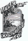
Apple logo derived from the Issac Newton image of him sitting under a tree which was their original logo, and simplified down to a simpler logo, and even that simpler Apple logo has gone through many itterations of over complicated for what it was.

Does a company always need an icon? Absolutely not - but it's a preference, not a necessity.
THink of Google and Yahoo - simple text. Then Apple and Microsoft, an actual apple and a 4 square window logo.
Apple logo derived from the Issac Newton image of him sitting under a tree which was their original logo, and simplified down to a simpler logo, and even that simpler Apple logo has gone through many itterations of over complicated for what it was.

Does a company always need an icon? Absolutely not - but it's a preference, not a necessity.
scotty
Ultimate Member
Hey Yohn,
Personally, I don't think the monogram really fits with the text and it's not that easy to read for me.
I don't think it helps that it's just a basic stroke and not a variable one either.
I'd either put some more thought into the monogram or ditch it all together and stick with the text.
You could do something nice with that and sometimes a little thing like making the first name a different weight to the second can add some interest.
scotty
Ultimate Member
To jump onto the logo debate, I agree with a lot of what's been said.
I really do notice logos and it's one of the first things I do pick up on but then I would wouldn't I?
I tend to think of branding as the clothes that a business wears and a Solicitor would wear different clothes to a Mechanic by choice and necessity.
People in general can be really brand aware in certain circumstances and not so fussy in others.
Try getting my youngest to put a coat on that hasn't got North Face or Napapijri on it and you'll get the idea.
(F*cking Road-man phase)
In contrast his older brother couldn't give a toss as long as it does the job and he can skate in it.
I think a bad logo is a lot worse than no logo.
A bad logo makes me think that either someone either doesn't have a clue or doesn't care.
Recently I had to hire a van at short notice and the only option for me was to get one from my own local logo nemesis.
Even my kids remarked on how bad the logo was.

Turns out it was run by a couple of older guys that offer a no frills van hire and they'd had this logo for years and years but they were sound enough but the logo kind of put me off if you get my drift.
I really do notice logos and it's one of the first things I do pick up on but then I would wouldn't I?
I tend to think of branding as the clothes that a business wears and a Solicitor would wear different clothes to a Mechanic by choice and necessity.
People in general can be really brand aware in certain circumstances and not so fussy in others.
Try getting my youngest to put a coat on that hasn't got North Face or Napapijri on it and you'll get the idea.
(F*cking Road-man phase)
In contrast his older brother couldn't give a toss as long as it does the job and he can skate in it.
I think a bad logo is a lot worse than no logo.
A bad logo makes me think that either someone either doesn't have a clue or doesn't care.
Recently I had to hire a van at short notice and the only option for me was to get one from my own local logo nemesis.
Even my kids remarked on how bad the logo was.

Turns out it was run by a couple of older guys that offer a no frills van hire and they'd had this logo for years and years but they were sound enough but the logo kind of put me off if you get my drift.
fisicx
Active Member
People often try too hard right at the beginning and agonise over logos, fonts, colours and all sorts of other niff-naff and trivia.
Establish the business, see if it's viable and then worry about branding (which ain't the same as your brand). When McD begin the golden arches wasn't even a thing, they came much later. The Starbucks siren has gone through multiple iterations (as have many others as @hankscorpio suggests).
And yes, a naff logo can put you off. So maybe it's better in the beginning not to have one and see how the business evolves. This will often dictate the logo you end up with
scotty
Ultimate Member
People often try too hard right at the beginning and agonise over logos, fonts, colours and all sorts of other niff-naff and trivia.
Establish the business, see if it's viable and then worry about branding (which ain't the same as your brand). When McD begin the golden arches wasn't even a thing, they came much later. The Starbucks siren has gone through multiple iterations (as have many others as @hankscorpio suggests).
And yes, a naff logo can put you off. So maybe it's better in the beginning not to have one and see how the business evolves. This will often dictate the logo you end up with
I agree with you there.
I've actually come to dislike designing logos recently.
I've kind of got a little fed up with doing them for some reason.