Site im doing at the mo

TomStutt

Senior Member
Hey all

Just looking for some feedback for a site im doing at the mo.

There wasnt really a brief. Its pretty much up to me. The company do ceremonies such as baby naming and commitment ceremonies and that kind of thing.

Ive attached a screenshot

web-homepage.jpg


Cheers all

Tom
 
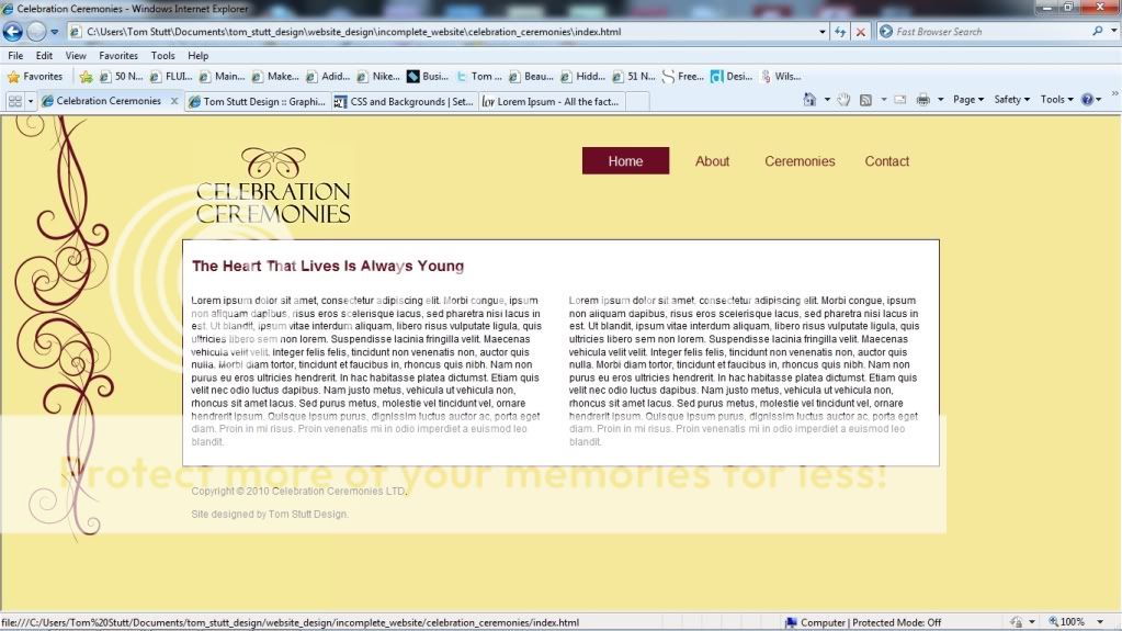
corners need rounding off, they're pretty harsh with the soft and curly design aspects

alignement of the contact is off in my view, I know it's likely down to the highlight box but if just looks a little off. Also too high up in my view

Copyright text etc doesn't need to be black, could make it a darker shade of yellow so it's not quite so prominent
 
Normally I hate it when people say round the corners but in this instanse I think Levi is right, also I think I would justify the text alignment of the content text to neaten it up a little.
 
Yes round of corners and navigation backgrounds, they will compliment the curves of the illustrations.
 
Back
Top