You are using an out of date browser. It may not display this or other websites correctly.
You should upgrade or use an alternative browser.
You should upgrade or use an alternative browser.
Site im doing at the mo
- Thread starter TomStutt
- Start date


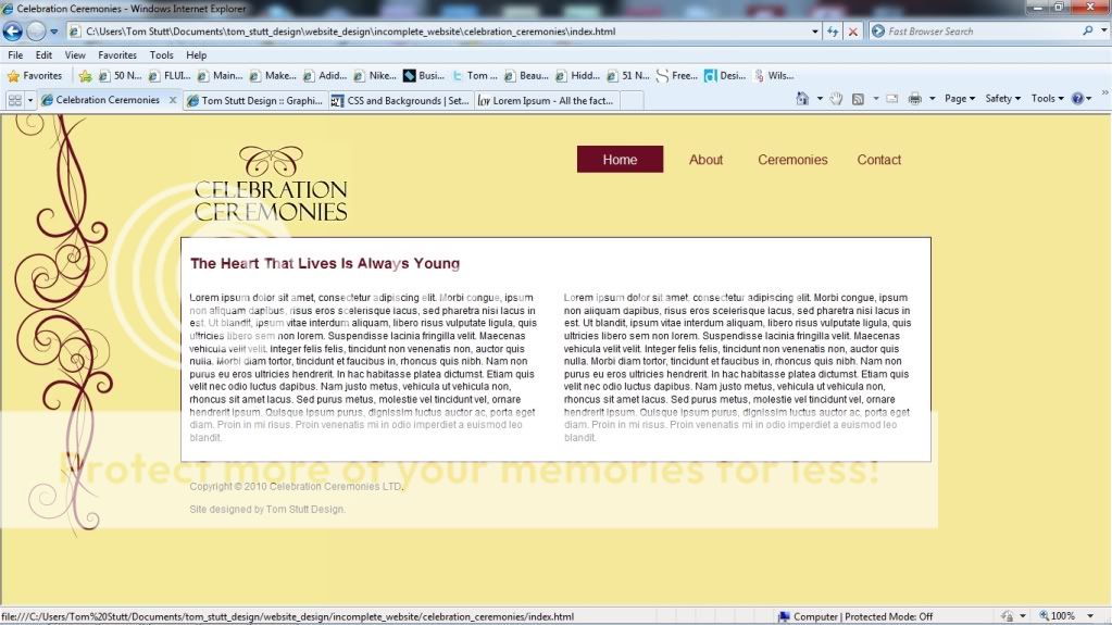
corners need rounding off, they're pretty harsh with the soft and curly design aspects
alignement of the contact is off in my view, I know it's likely down to the highlight box but if just looks a little off. Also too high up in my view
Copyright text etc doesn't need to be black, could make it a darker shade of yellow so it's not quite so prominent
alignement of the contact is off in my view, I know it's likely down to the highlight box but if just looks a little off. Also too high up in my view
Copyright text etc doesn't need to be black, could make it a darker shade of yellow so it's not quite so prominent