Self branding help needed!

good point iain, but often my first point of contact is twitter, blog or business cards so if people arent hooked by the logo they wont get as far as to see the portfolio. maybe im too close to the whole project, i just think i can do better!
________
Iolite Vaporizer
 
The problem with Twitter is that overly complicated logos don't work (in my opinion) as the avatar is so small. Besides there is some argument to having just your photo on Twitter, as it is supposed to be more personal, and less business. So from that point of view, simple and bold is the way forward for a logo on Twitter.
 
true iain, you have got me thinking now. i guess what im trying to say is that I want something iconic, instantly recognisable as me.

That can be simple and clean and basic and bold, but I dont think at the moment that I have an iconic logo. I almost have an 'off the shelf' logo at the mo.

Its hard to explain that feeling you get when you produce something that you just know is good, but I dont get that feeling when I look at my own logo. Theres no sense of pride or an urgency to show it off. Its just ok and 'ok' isnt good enough!
________
Buy iolite vaporizer
 
Well as I said, I like it as it is, but if you are not happy with it, then try tweeking what is already there.

Maybe working more on the "dave will..." concept and applying it to the various disciplines.
 
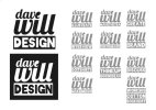
Personally I really like the new logo designs. Very nice indeed. #3 & #4 for me are favourites, definitely not #1 or #2. #5 is interesting but the font's too lightweight, almost feels as it would be crushed! For me I think #4 is the favourite but you could do something similar to #3 as a variation to that logo if ever needed. The colours are spot on for me and I really like the e being the dot on the i too.

Personally I'd expand on #4 and try a few different fonts, maybe a less 'sketchy' look and more formal to see how that looks in that style to see what looks best.
 
Thanks for the comments guys, even tho its conflicting comments, thats what I love about design, it really is subjective!

Thanks for your input Fred, i think you are right about 5 being too lightweight and 1&2 are too large. The colours are purely for display purpose for now. Im going to try it with various Dave Will's... and post an update.
________
California dispensaries
 
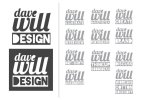
Hmm, so Ive expanded on my earlier design number 4 by applying the various services I ofter to the dave will branding.

Thoughts anyone?
________
ROLL A JOINT
 

Attachments

  • dave will v2.jpg
    dave will v2.jpg
    54.2 KB · Views: 14
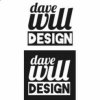
I'm not sure about the filled in "D" as well as the "e".

I know the colours aren't set yet, but I do prefer this concept much more without the red. I think one colour is the way forward.
 
thanks iain, the D is filled in as that is how it comes with the font blackout. Obviously I could tweak it though to suit my needs. I think you are right tho, its too much to have the D filled in as well as the E. Do you still prefer the old version?
________
Park Royal 2 Condominium
 
I should have recognised Blackout there shouldn't I? Is there a similar font to Blackout that you could use without the fills?

Still like the current one, but this one isn't finished! :D

I like the boxed off one, but not sure on the box within the box.
 
Version 3 below, Ive filled in all of the letters that were previously solid. The version in a box is just to show a white out version on a coloured background.
________
Slavelatina4u
 

Attachments

  • dave will v3.jpg
    dave will v3.jpg
    58.1 KB · Views: 21
Based on a comment on twitter, I have put the whole back in the 'e' as an option. Im not sure if its as strong as the previous version.

Looking at it again now I dont know if I like the font used for design. I want something legible, but not as strong as what ive used. anyone got any suggestions?
________
The Legend Condominium Pattaya
 

Attachments

  • davewill options4.jpg
    davewill options4.jpg
    9.7 KB · Views: 14
Hi Dave,

I'm not really feeling it to tell the truth. I'm not keen on the scripty font, and I really don't like the cartoon font you've used for 'DESIGN', They look like totally different elements, and I don't read it as 'Dave will design'

I'd suggest you strip it right back. If the idea is the phrase "Dave will <insert whatever>" you have to make that being legible your first concern.

The 'e' as the dot of the 'i' seems a little fussy too. Sorry I can't be more constructive really.

If you really are after something 'iconic' for a logo focus on making a clever monogram with DW, then use your dave will design, dave will illustrate, dave will work for food (whatever) as a tag line, or filler for your website header. Maybe even turn it into a branding feature. You could do something really nice with a repeated line typography with all of the different variations etc.

At the moment it feels like you're re-arranging the deck chairs on the titanic, making small changes to a design that on the whole isn't structurally sound to begin with. Wallpapering a wall won't make it stronger!

I think you might have to question the concept rather than the minutiae of the design.

Sorry if it sounds harsh, but I don't see what you have so far as a big improvement on your existing identity.
 
Thanks Ken, I really appreciate you taking the time to give my ideas some thought.

You are right about the design bit looking completely separate from the top 2 lines so thats not working.

Overall I agree with your comments, Im trying to force something to work that maybe just isnt meant to be. Maybe I am trying to be too clever? A friend of mine just posted me this link on twitter...
Believe in | Identity Designed
It tells the story of an agency with a very similar idea to mine but their branding is much simpler. It is clean and simple and very effective. I think really that is where I should be heading. If im honest im really into scripty fonts at the moment so im probably just trying to force the use of that into this project which is so easy to do when you are both the client and the designer. Im gona take another crack at it and try and be more disiplined.

Thanks to everyone for their comments so far tho, u are most helpful. Feel free to carry on letting me know your thoughts. Id be interested to hear everyones opinion.
________
BUY SILVER SURFER VAPORIZER
 
Hi Dave,

Agree with Ken on this, the new design is almost trying to be too clever by linking in, as it should be a dot above the 'i' and not an apostrophe style shape that the 'e' is currently giving you. I think if you're aiming to go for a cleaner, perhaps a more 'upmarket' look (not sure if upmarket is the right word to use) then a simple but clever type arrangement with strength and balance could be really effective.

I would lose the extra tag lines, as you have done with the new versions, and focus on DaveWillDesign initially, try and get the balance of those elements right first, then bring in the other applications, I'm sure there's something you can do with the 'WILL' part, possibly in italics as I mentioned previously with the letters almost leaning onto each other perhaps?

What's the market you're aiming at? What is that you feel fails to hit the mark with your current identity? Perhaps thinking about those answers may help you get some inspiration :)

Hope that helps,
Greg

P.S I know how hard the self branding process can be, took me months to get to my current identity, blast from the DF past - here was the thread where it evolved > http://www.designforums.co.uk/logos-identity-branding/522-updated-logo-identity.html
 
Thanks for your comments Greg, I just read your own branding thread with interest. At least you had a clear direction of where u wanted to end up!

I think your question about who I am aiming for etc is very apt. I was thinking about that this evening. In my day job, all of my graphics work is very corporate and because I am fortunate enough to work with some large companies and football clubs my work ends up being very stylish/moody/clean cut. Unfortunately because of the strict guidelines set by many clients I am often restricted to what I can and cannot post on my own site so I dont have much to show off online.

However, in my spare time Im much more laid back and I suppose my current branding reflects this. I want to be seen as friendly/warm/humerous/playful/creative etc but this contrasts with my day job of being a professional designer.

Because of this my personal branding has ended up looking quite fun and cartoony to relflect my personality, but Im concernerd that because of that I might not be taken seriously by potential clients. My blog could be that of an illustrator rather than a graphic designer when you look at the header. Its fine for showing off personal projects and discussing issues on my blog but maybe it doesnt suit the type of clientel that looks to hire freelancers for projects.

Im really pushing at the moment to earn some extra dough as I have a wedding to save up for and a house to buy, so I want additional freelance work for my evenings/weekends and im concerned that the simple, playfulness stops potential clients from taking me seriously when I know I am able to produce good quality, corporate work as well as fun, illustrative personal projects.

In a nutshell, Im confused!
________
Live sex webshows
 
Hi Dave,

I guess it comes down to the work you want to be producing in your own time on a freelance basis, what work do you enjoy doing more? is it the illustration work because the day job is very corporate, or has that just happened as a result of the blog?

One suggestion I have for you either way is to get your own domain & hosting, no matter how good the design, a website at name.blogspot.com is always going to come off as less professional than yournamedesign.co.uk in my view, perhaps the same for your clients? It's easy enough to setup a Wordpress theme so you can continue blogging from the domain, that way you could then separate a portfolio and blog posts, or even keep your existing blog and use a new domain for purely commercial portfolio, contact, etc.

I think deciding which work you want to undertake in your own time is key to pushing forward with the new identity, I think the name could easily take you either way so that's not the problem, and of course not to say one way means you can't do both types of work, just that having a style in mind should help get your identity positioning right for the bulk of clients you want to attract, if that makes any sense?

Greg
 
Not to say there isn't a way of combining all the elements, as many/most design companies will offer a variety of design styles to suit their clients target markets, but thinking about your target market should help :)

Keep us posted on how you get on
 
Back
Top