You are using an out of date browser. It may not display this or other websites correctly.
You should upgrade or use an alternative browser.
You should upgrade or use an alternative browser.
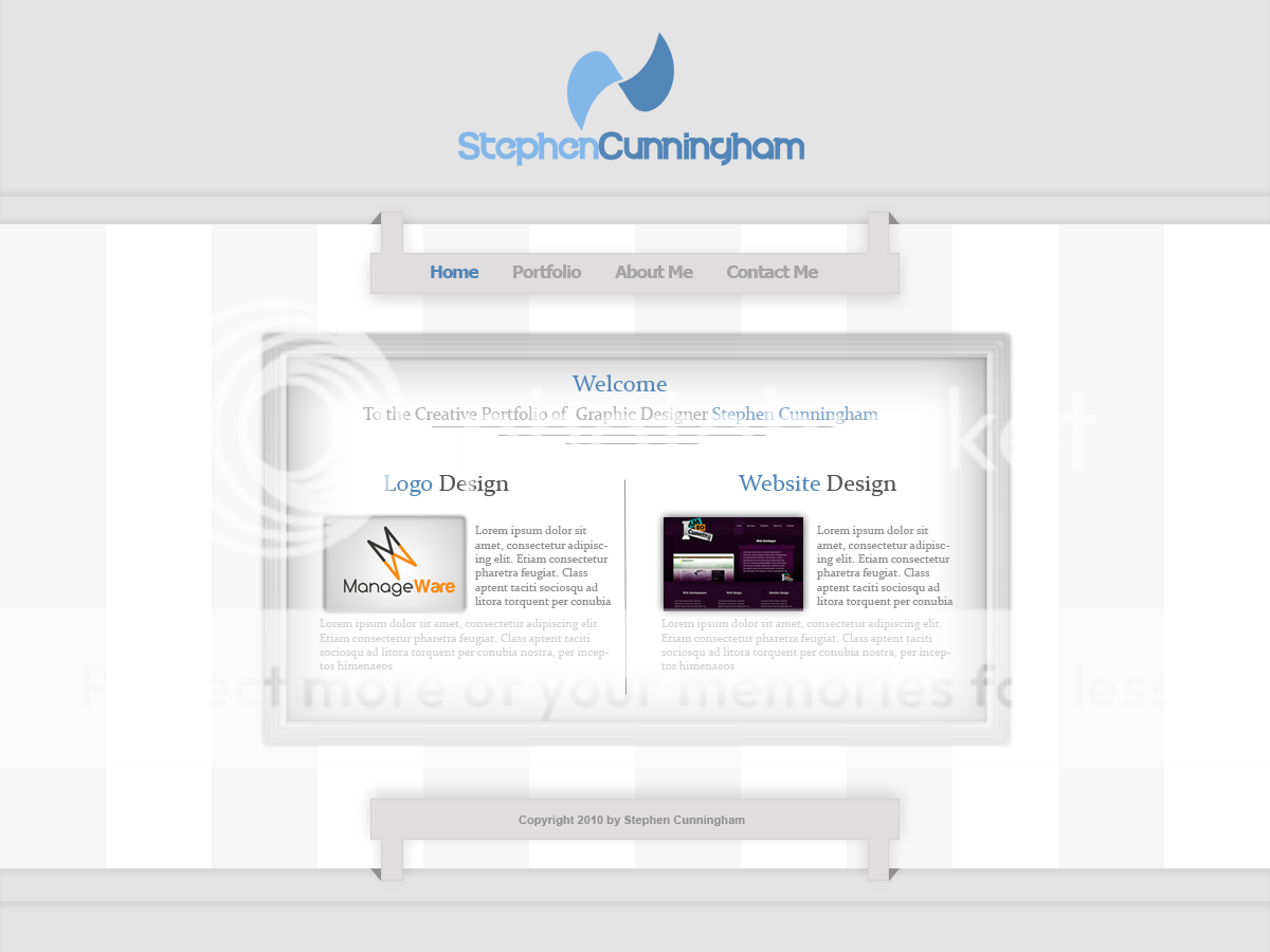
new portfolio design
- Thread starter stevey17
- Start date
Aarlev
Member
Hi Stephen,
First thing that comes to my mind is that It really needs some contrast and a more clear separation of elements. Also I'm not sure the typography used in the content goes with the more futuristic feel of your logo. Mixing Sans-serifs with Serifs can definitely work, but here I think it clashes too much.
There are a lot of other things that could use some tweaking, but I'd try to nail the creative direction and vibe/feel of it before going into the smaller details and refining it.
Just my 2 cents, hope it helps in some way!
Thanks,
Soren
psynai
Junior Member
I Agree with aarlev and mrp2049.
I'd change the triangles on the bars so they are on the opposite side of the bar.
The grey layer that seems to be behind the stripey layer, change its colour to just off white like say #f7f7f7 or something, and add a 1 px highlight to the top and bottom so it looks like its actually above the grey bg. It sets up the framing of your content nicely.
I'd also use the nice blues from your logo for the stripes, and add some kind of subtle lighting effect over it, to again give it some depth. And lastly turn down the opacity and the size of the shadows you have for the
thumbnails.
Just some suggestions though, you dont have to go with 'em
