Need help with a logo, please

waterwoman

New Member
Hi. I am a sculptor and most artists use their names for their businesses but when I went to buy my name for a domain, it was already taken by another artist. My second choice was to use the family name of Spirauskas and I used a logo generator (pitiful, I know, apologies) and when the Spiraukas logo came up, not only did I like it, I thought the cubist symbol that popped up with it was a kismet as that is the type of sculpture I do. The last picture is one of my works. I then went to a few business meetups for feedback and everyone kept prounouncing the name wrong, saying spir-aw-kus (without the first 's') instead of spir-ow-skus. Joking to my friends about the meetings, I said that I should just call myself The Slow Sculptor as it takes me 2-3 years to make something and I will only have 3 pieces to post to my site as a result. Any feedback provided will be greatly appreciated. Along with the logo designs, what do you think of either business name? Thanks to you who take the time to help. Sincerely grateful.logocritique2.jpg
 
First of all, you don't really need a 'mark' with your logo. A lot of people spend too much time trying to come up with something that is so
personal to themselves, when really, no-one else cares (been there, done that). What's important is your work, so don't waste time on this
and get cracking with more sculptures, they look great!

I prefer the Slow Sculpture logo, it's clean and simple. I'm afraid most of us here in the UK are heathens and your surname will always be a problem for some
of us to pronounce! Apart from that, the mark isn't of your work and that font isn't easy on the eye. It would be fairly easy to come up with a 'S' design in
your sculpture style. That's what I would try. Or just a line version of that piece of work.

What's wrong with Waterwoman as a name, is that taken?!
 
Why not just your business Spirowskus - as that's how it's spelt phonetically, and it's still kinda your family name.

The font is awesome - just make sure you can use it commercially it should be in the license of the font from where you got them from.

I like the 3d model lineart thingy - it's cool.

If you want to commission a designer from the forums - there's a section on the forums for that.
 
I would just saw to keep the font thin the same as the sculpture.

If you like that sculpture as your logo - approach the logo creator where you got it from and ask them can you buy it from them and have it removed from their catalog.
 
I'm going to be a little different to the rest, and don't take this the wrong way.

Do you actually NEED a website/logo etc when you are taking 2-3 years to make a single sculpture. If you have a website etc you're inviting more people to get in contact, assuming they're not put off by 2-3 years bit, and you're likely going to end up turning down work offers which in turn can lead to a more negative opinion of you.

I could understand if you were knocking out work on a monthly basis and you wanted to showcase it or sell it from your site but if you were intending to show your development of the sculpture you'd arguably be better off using something like instagram with the right hashtags. It would likely open you up to far more people than a website as well.
 
If you are going to use your name then I'd use a very legible font.

I found myself spelling it out individually rather than reading it.

I do like "The Slow Sculptor" though as it's very memorable and I think that would make a great handle for social media and it does seem to be available across the board but I'd register it after posting publicly as someone might just do it and try to sell it to you.

So you didn't make the sculpture of the cubist face in the logo?
That'd be a bit like me as an Illustrator using another Illustrators work for my branding.

Why not just get someone to so a similar thing but with your work?
It'd be quite a simple task.

Screen Shot 2019-05-24 at 14.10.08.png
 
First of all, you don't really need a 'mark' with your logo. A lot of people spend too much time trying to come up with something that is so
personal to themselves, when really, no-one else cares (been there, done that). What's important is your work, so don't waste time on this
and get cracking with more sculptures, they look great!

I prefer the Slow Sculpture logo, it's clean and simple. I'm afraid most of us here in the UK are heathens and your surname will always be a problem for some
of us to pronounce! Apart from that, the mark isn't of your work and that font isn't easy on the eye. It would be fairly easy to come up with a 'S' design in
your sculpture style. That's what I would try. Or just a line version of that piece of work.

What's wrong with Waterwoman as a name, is that taken?!
Hi. Thank you for your response. I like Water Woman too but Slow Sculptor seems more fitting. I agree with your suggestions. What fonts would you suggest?
 
At a glance the tools at the top remind me of a dentist or food.
Yes, the tools absolutely look like dentist tools. In school, we would receive old dentist tools to use to sculpt. They are the best. Wardy suggested not using the marks at all and you have reinforced that so thank you. Much appreciated. Hope you have a great day.
 
I like the name The Slow Sculptor - I think it's different and stands out.
Thank you. It is what I am going to go with as much as I like the other one, it has just caused too much trouble. I hope people find the name amusing too and not a put down. Hope you have a great day.
 
It's difficult to say without knowing what fonts you have access to. You want something friendly, legible, something a bit different but not too
much of a 'display' font. That font isn't too bad, it might look ok as Slow Sculptor.
 
Why not just your business Spirowskus - as that's how it's spelt phonetically, and it's still kinda your family name.

The font is awesome - just make sure you can use it commercially it should be in the license of the font from where you got them from.

I like the 3d model lineart thingy - it's cool.

If you want to commission a designer from the forums - there's a section on the forums for that.
The font is awesome, I love it. I couldn't get the logo company to tell me what it is though so I wouldn't be able to type it up with the new spelling. I think the Spirauskas name has been too much of a problem. The last Spirauskas in my family has passed and I am the administrator of his estate and everyone I talk to - banks, lawyers, utility companies, etc. - absolutely butcher the name. It is my favorite logo but I think I need to pass on it. I like the sculpture mark but another poster suggested I use my own artwork for the mark which is a good idea. When I have asked Shutterstock for marks I like, they have told me the minimum starting price for a mark for a logo is $10,000. Not sure what this company would charge but I think I will make my own. Thank you for your input, it is much appreciated.
 
I'm going to be a little different to the rest, and don't take this the wrong way.

Do you actually NEED a website/logo etc when you are taking 2-3 years to make a single sculpture. If you have a website etc you're inviting more people to get in contact, assuming they're not put off by 2-3 years bit, and you're likely going to end up turning down work offers which in turn can lead to a more negative opinion of you.

I could understand if you were knocking out work on a monthly basis and you wanted to showcase it or sell it from your site but if you were intending to show your development of the sculpture you'd arguably be better off using something like instagram with the right hashtags. It would likely open you up to far more people than a website as well.
Most artists sites I go to, use their name as their logo. There has to be something to label the site. My name has already been taken, ironically by another glass artist (I work in glass too) on the other side of the country so I had to pick something else. I do want to build a site of my work and sell the pieces, even though there are currently only 3, it is a starting point. I already have a caster lined up. I can't cast bronze myself, even though I cast my current pieces myself, as I don't have my own bronze casting studio and can never have one in my home (too dangerous/too costly/just not possible). The above sculpture was cast at a university during a class. I will totally use Instagram and social media to promote the work. You are 100% right on that. I am not expecting much from the site as far as income. I have other little businesses and together, all those little drops, will eventually fill the bank bucket. I get what you are saying but I doubt I will get many work offers so it is ok. The site is for people to buy/be interested in what I currently have. Without a web presence in this 21st century, I am nothing and it won't cost me much to get it done as I will be doing it myself so why not? Right now, they are just sitting in my basement collecting dust :) I also don't plan on doing the brick and mortar gallery/show circuit - way too time consuming. Thank you for your input. I didn't take it the wrong way at all. All opinions are appreciated. Everyone's voice matters, many thanks.
 
If you are going to use your name then I'd use a very legible font.

I found myself spelling it out individually rather than reading it.

I do like "The Slow Sculptor" though as it's very memorable and I think that would make a great handle for social media and it does seem to be available across the board but I'd register it after posting publicly as someone might just do it and try to sell it to you.

So you didn't make the sculpture of the cubist face in the logo?
That'd be a bit like me as an Illustrator using another Illustrators work for my branding.

Why not just get someone to so a similar thing but with your work?
It'd be quite a simple task.

View attachment 6880
Hi. You are absolutely right, I should use my own piece as the logo. After reading the feedback, I will be choosing The Slow Sculptor. One commenter mentioned that he didn't think the font was that great for the Slow Sculptor logo. Do you have any suggestions for fonts? Thank you.
 
It's difficult to say without knowing what fonts you have access to. You want something friendly, legible, something a bit different but not too
much of a 'display' font. That font isn't too bad, it might look ok as Slow Sculptor.
Access to all fonts online which are thousands. Would love to know what fonts you like. Please share?
 
That's like asking how long is a piece of string. This is so personal to you that it needs to be your choice. Head over to Wordmark.it and that can show you the name in all the fonts on your system.
 
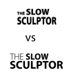
Better? What do you think of this one? Thank you.
This is a great forum and everyone is wonderful, professional, and gracious. I very much appreciate everyone's help and donating their time. Thank you.slowsculptorlogo3.jpg
 
That looks fine, though the sculpture is a bit big for me against the type. How does it look with some tinted infill colour?
 
I wouldn't scale the type for the 2nd line like that, it looks a bit disjointed with the different sizes.

Perhaps this illustrates my point better:


6896
 
Back
Top