Mitch
Member
Hi,
I've been working on a logo for myself with the intention of using it as a starting point to then develop an online portfolio. I'd really appreciate some feedback on my efforts.
I'm using my initials and/or name for the sake of keeping it simple. The intention is to produce a clean, well-designed logo which suggests a friendly and professional tone. If possible I want to include a little wit but it's not a must.
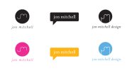
I have attached the 3 concepts which I am happiest with - each logo in B&W and with a splash of colour. The far right logo is meant to represent a light-bulb, albeit in an abstract way, and to suggest that my design is ideas-driven - which I hope it is! The middle attempt is merely conveying communication, which is what design is all about. The far left logo has no deeper meaning, but I just liked it's simplicity.
Thanks,
Mitch
I've been working on a logo for myself with the intention of using it as a starting point to then develop an online portfolio. I'd really appreciate some feedback on my efforts.
I'm using my initials and/or name for the sake of keeping it simple. The intention is to produce a clean, well-designed logo which suggests a friendly and professional tone. If possible I want to include a little wit but it's not a must.
I have attached the 3 concepts which I am happiest with - each logo in B&W and with a splash of colour. The far right logo is meant to represent a light-bulb, albeit in an abstract way, and to suggest that my design is ideas-driven - which I hope it is! The middle attempt is merely conveying communication, which is what design is all about. The far left logo has no deeper meaning, but I just liked it's simplicity.
Thanks,
Mitch
")