Yes, I want the curved look, as I stated previously. It does peel away and that was what my image was trying to convey, except in a straight line. We are on the same page there. I just don't know how to do it from a technical point of view - yet!
The colours were partly inspired from reading an article about what red conveys and also from the brand leaders. If you look at www.rocktape.com, one of the brand leaders, you can see where I am coming from. Also the same with Kinesiology Tape | KT Tape.
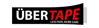
As for the logo, KT Tape talks about Stop the pain, feel the burn. So, I think Less Pain, More Gain is not too bad.
The colours were partly inspired from reading an article about what red conveys and also from the brand leaders. If you look at www.rocktape.com, one of the brand leaders, you can see where I am coming from. Also the same with Kinesiology Tape | KT Tape.
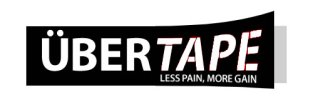
As for the logo, KT Tape talks about Stop the pain, feel the burn. So, I think Less Pain, More Gain is not too bad.