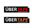
My logo, Your opinion

Yes, I want the curved look, as I stated previously. It does peel away and that was what my image was trying to convey, except in a straight line. We are on the same page there. I just don't know how to do it from a technical point of view - yet!

The colours were partly inspired from reading an article about what red conveys and also from the brand leaders. If you look at www.rocktape.com, one of the brand leaders, you can see where I am coming from. Also the same with Kinesiology Tape | KT Tape.

As for the logo, KT Tape talks about Stop the pain, feel the burn. So, I think Less Pain, More Gain is not too bad.
 
Great seeing the progression of the logo! I agree with the guys, it's definitely moving in the right direction. And stick to hankscorpio's advice, leave the colour til last as it draws away from the fundamental design. Looking good though!
 
I can't help to tell you how to achieve this look technically, as you are using Fireworks. I have never created anything in Fireworks in my life.

Regarding your comments on the colour, isn't this even more reason to move away from the black and red? Rather than being another kinesiology sports tape camouflaged on the self amongst the others, you can choose to stand out from them. Another thing is, if you look at their colours closely you will see they have used a different black and red to what you have. Yours looks to be very much 100% black and 100% red, it's very striking on the eye and quite unpleasant. Also, I am surprised you have found that the colour Red conveys things relatable to kinesiology sports tapes, as I would argue it conveys the opposite, eg. pain, anger. While kinesiology sports tapes to me means, support, aid, healing, relief etc.

Lastly, 'Stop the pain, feel the burn' has a totally different meaning to 'Less Pain, More Gain.' The fact is, as the old saying goes 'No pain, no gain.' So to say 'Less Pain, More Gain' totally contradicts itself.
 
I think the slogan is less to do with graphic design, so lets focus on the graphics.

I've done the curved look, although I am not so sure about it now. I used the Warp tool in Photoshop.
 

Attachments

  • shortlist-to-upload-1-3.jpg
    shortlist-to-upload-1-3.jpg
    12.8 KB · Views: 17
There's grey in that. Logos need to work in black and white only.

But even with the shadow gone I think it will work.
 
I think the slogan is less to do with graphic design, so lets focus on the graphics.

I've done the curved look, although I am not so sure about it now. I used the Warp tool in Photoshop.

The slogan is part of the design, but fair enough...

The shadow doesn't work. It needs to be the tape peeling off, rather than it curling, leaving a shadow. It would also work better in black and white without an unnecessary shadow.
 
Its meant to be peeling off. i.e. its not meant to be a shadow. How would I make it look like its peeling off? i.e. make it look not like a shadow.
 
I think the 'peel' looks a bit too gimicky. Dig out the pencil and paper so your not restricted by software and get sketching! Then post your concepts up? Worth a shot!
 
Back
Top