Logo/identity

theking79

Member
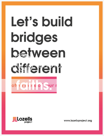
This is a logo created for a brief to create an identity for a community project called Lozells project, the place is a very multicultural place, the project aims to bring the community together and stop violence between religions etc.

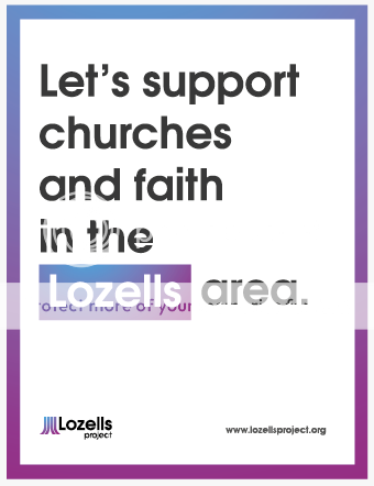
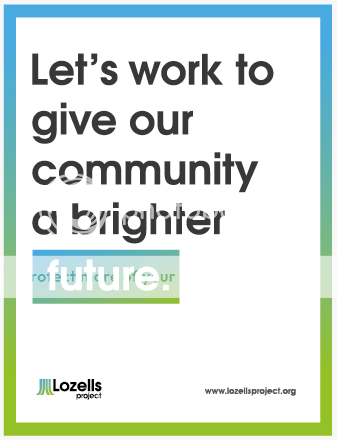
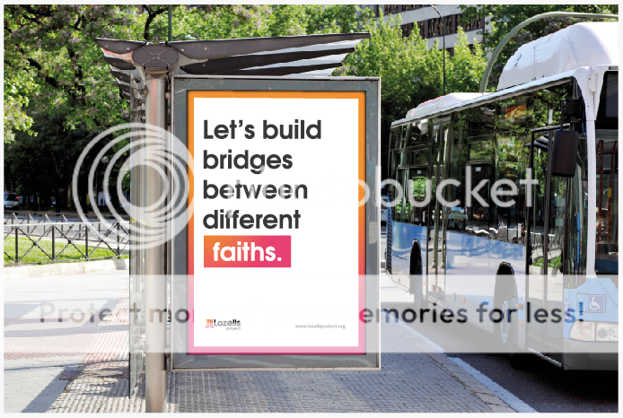
I have also created a series of adverts which is part of the identity i am creating.

Picture1-52.png


Picture2-34.png


Picture3-22.png


Picture4-13.png


Picture5-7.png


Picture7-3.png
 
I thought it reminded me of an old computer but couldn't put my finger on which one until I read the later posts.
 
Looks very Atari yes. I'm also wondering what the reasoning behind the symbol is? Why have you chosen this shape and these colors? How does it tie in with "community/stop violence between religions"?
 
Aarlev said:
Looks very Atari yes. I'm also wondering what the reasoning behind the symbol is? Why have you chosen this shape and these colors? How does it tie in with "community/stop violence between religions"?

It is supposed to symbolize unity and growth between cultures, the symbol shows different lines coming together, hence the tree type mark.

ive changed it to horizontal, not sure if it works, reminds me of a logo for roads or something

Picture8-3.png
 
if the concept is 'tree and growth and unity etc' would it not be better to use the two 'L" in the middle ( use the 2 central trunk shapes in your logo) of the namestyle and develop the trunks and tree from there with a graphic tree? Then at least you have your vertical shape.
At this stage the tree trunks are too cryptic as they stand
 
personally I thought atari and then the four pillars of hindu, maybe a church tower but either way I'd be starting over from scratch as you're too close to the atari symbol and horizontally it just doesn't work
 
Seems a little to 'corporate' for the brief and also looks familiar. It sucks hearing this, but there are 2 logos I can think of that already exist and take that shape.
 
Back
Top