Logo Comparison Advice

Hi, I have made 3 similar logos and I wondered what peoples opinion is on which is best as I cant decide (1, 2 or 3)

If you could let me know how easy you think it is to read and what you think it is actually supposed to say as well that would be great.

Many thanks
 

Attachments

  • Logo 1.jpeg
    Logo 1.jpeg
    25.7 KB · Views: 3
  • Logo 2.jpeg
    Logo 2.jpeg
    28.2 KB · Views: 3
  • Logo 3.jpeg
    Logo 3.jpeg
    27.9 KB · Views: 3
Hi sorry I should have probably given more background info to the project.

Its supposed to be for a gym / strength equipment brand (barbells, weight plates, squat racks etc)

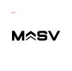
Youre right its is supposed to say Massive, but stylised as MASV.. and the chevrons are supposed to symbolise getting bigger.

The fact that they relate to the military isnt intended, but I guess works well anyway as people in military do train weights etc.

I initially liked Logo 1.. but the reason I started experimenting with the chevrons was that I didnt think they looked unique enough if ever used on their own as an icon.

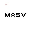
So in Logo 2 I made the bottom one hollow, and also added more space / kerning between all letters, purely for aesthetics, as I see alot of modern brands do this.

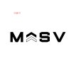
But I thought it still looked a little.amaturish so my own personal favorite currently is Logo 3.. but wasnt sure if it was "too much".

I want it so when printed on expensive gym equipment in the shops it will look good.. but just wanted others opinions

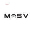
P.S. the spacing between all letters is exactly the same. Obviously the gap in bigger at the bottom of the V, but I've messured the gap at the top since thats the widest part of the letter.
 
Well, they're basically all the same but they look progressively less like an A as they go along. I didn't read it as an A to start with and certainly not as Massive, but I'm old!
It's up to you if you want your logo to be an abbreviation, but for various reasons it needs to say what the company is or does. Put Massive underneath at least, and I think
you need to work on those chevrons - it definitely looked military to me.

PS - It's called kerning, and the V needs to move slightly nearer the S. ;)
 
Right ok I have adjusted the Kerning now (moved the V closer to the S)

And have also made another adaptation of the Chevrons.

What are you thoughts on this now aesthetic wise
 

Attachments

  • Logo 4.jpg
    Logo 4.jpg
    51.9 KB · Views: 1
That looks ok, I think I still prefer the first one, though that last one does look less like corporal stripes. Have you tried it with an inverted V, but with a smaller arrow inside it? Though that might look like a similar
existing logo. If it's just for a project you should be fine. I still think you need to have what the company does underneath.
 
I prefer the first one and I think it'll be easier to read at small sizes compared to the ones with thinner lines.
 
Think most would say the first one.

Although has connotations with the Citroen logo.
But it's pretty nice and easy to read.
 
Back
Top